- AKA
- Yop
But is something like that possible from a banner?
Yeah sure - either you layer the HTML elements for it on top of the image, or you divide the image up into a seamless grid of clickable elements of sorts.

But is something like that possible from a banner?
Those look much better. *thumbs up*Heres a mockup of the buttons with a different font, Trojan Pro
You've spoke for some time about the fact that you want to utilize dropdown menus, but could you please create a draft to show in detail what you actually have in mind? If you don't present your ideas then I will for sure keep on coming up with suggestions that you don't like.Im not sure about the dropdown. We could make much better use of it.
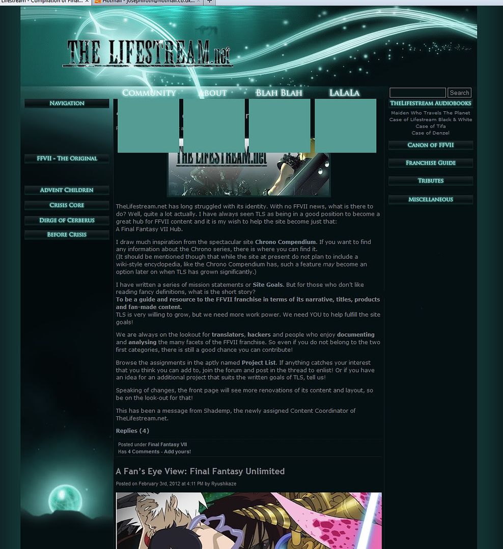
I'm thinking of possibly merging Contact with Staff List.Stuff like contact info etc should go under the About header.
I can think of an "FFVII Remake" section header, plus possibly dividing the Tribute header into more headers instead. We'll find a way to utilize it.Also, the right frame should be ulilised a bit more

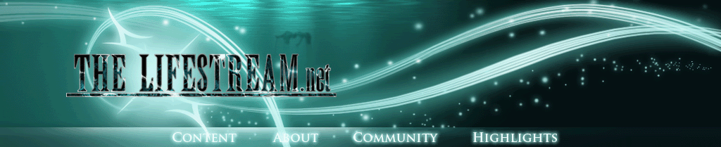
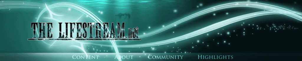
What would be really cool, and maybe you're already planning on doing this, is to have each of the individual "Content - About - Community - Contact Us" links highlight when you mouseover them. Assuming you still have the .psds that should be easy to implement.
The second image looks great, but I think the text on the first one doesn't stand out enough from the background. "Content" and "About" suffer in particular from being white text on a bright part of the image.
Actually I've kept more in-detail stuff to private messages. No more of that.Edit: Ok, only the last 3 pages is related. I've read it. Doesn't seem like you guys have a set plan on how to do things yet - or maybe you have a thread in a subforum I can't see.

I have assumed that the look with articles in the middle is the default and obligatory layout of a WordPress site. Not that I can think of any other system I prefer.Is there a wish that the front page still have that blog look with the articles in the middle? With maybe article teasers in the left and right columns as teasers? Or is there a wish for a more newspaper style theme? Both are perfectly possible. I've done a newspaper theme on a blog, and the possibilities are endless.
This is indeed important information. I can't tell in what way, yet, this might change our vision, so I'll just try to present the planned look of the front page then you can suggest how we might improve, whether it be by adjusting a few things or completely scrapping my ideas.There is written a bunch of theory on this stuff, [U]http://www.useit.com/papers/webwriting/[/U] is a good example. Check out "F shaped pattern for reading", it's a good indicator for how the mind works when browsing web pages. You have very little time to capture the readers interest.

How dare you try to be helpful and provide constructive criticism? You sicken me.Sorry if I come across as a know-it-all. But I do know some of this stuff. I can be utilized.
 .
.