FFVII Transparent Logo

Pixel

The Pixie King
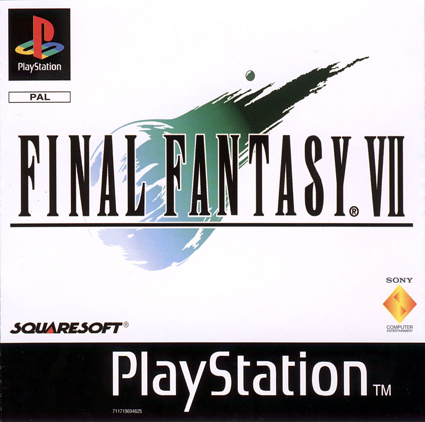
I couldn't find a transparent PNG of the FF7 logo that didn't have the white deleted from the meteor part, so I figured I try to make one.
https://drive.google.com/file/d/0Bw4Tk7aQlnO5NDA5RTFIaEszQnM/view?usp=sharing

FFVII%20LOGO%20TRANS_zpsyzzypql7.png


EDIT - The Y looks weird
 

Ghost X

Moderator
Well, to be fair, when I do a quick google search, the Y does look weird in what look to be official art, so...

I've never noticed it before too. Life ruined! :awesome:.
 

Pixel

The Pixie King
I don't think that is actually the official font.

Here's one with more Remake-y colours

FFVII%20LOGO%20REMAKE%20TRANS_zpsoxeqns2e.png
 

Lex

Administrator
Looks great. Definitely prefer the more saturated look of the original in the OP.

Well, to be fair, when I do a quick google search, the Y does look weird in what look to be official art, so...
Holy crap you are right it does look a little weird.

784_front.jpg


252807-20-mejores-juegos-playstation.jpg

Lmao how have we all never noticed that the Y is not symmetrical?
 

Cthulhu

Administrator
AKA
Yop
I think it shows more now; the white outline makes the bend on the right side of the Y fork (outside) look more prominent than on the full white background.
 

X-SOLDIER

Harbinger O Great Justice
AKA
X
So, the Y does look weird, but in your versions, it seems like the white outline curve goes ever-so-slightly too far in to the line of the Y itself and then curves back out of it which is definitely exacerbating the a-symmetrical thing.


X :neo:
 

Attachments

  • FFVII LOGO TRANS_zpsyzzypql7.png
    FFVII LOGO TRANS_zpsyzzypql7.png
    201.9 KB · Views: 11
Top Bottom