You are using an out of date browser. It may not display this or other websites correctly.
You should upgrade or use an alternative browser.
You should upgrade or use an alternative browser.
Ryvius' Art [Space Omelette]
- Thread starter Rydeen
- Start date
Rydeen
In-KWEH-dible
Thanks guys!
@Ghost My favorite part about that pic is that it was a semi-candid shot and not even at my own house. Usually I have to take many photos, but that one just came out perfect. I guess I'm just destined to be Vegeta.
-
Someone gave me a lamp. I want to deck it out, but I'm not sure what I wanna do. Maybe a mosaic from CD shards.. The round, aesthetically disjointed surface makes it hard to work with. It is shaped like a flower, but that sounds kinda generic.

@Ghost My favorite part about that pic is that it was a semi-candid shot and not even at my own house. Usually I have to take many photos, but that one just came out perfect. I guess I'm just destined to be Vegeta.

-
Someone gave me a lamp. I want to deck it out, but I'm not sure what I wanna do. Maybe a mosaic from CD shards.. The round, aesthetically disjointed surface makes it hard to work with. It is shaped like a flower, but that sounds kinda generic.

Rydeen
In-KWEH-dible
An antique lamp like that is begging for a steampunk remodel.
I've thought about that, but I don't really have steampunk looking hardware. I really do like the idea, though, probably more than any other idea, so maybe I should procure some..
Littlewing
Pro Adventurer
- AKA
- human
ah yes you feels it really nice (that desk I mean)Thanks guys!
@Ghost My favorite part about that pic is that it was a semi-candid shot and not even at my own house. Usually I have to take many photos, but that one just came out perfect. I guess I'm just destined to be Vegeta.
-
Someone gave me a lamp. I want to deck it out, but I'm not sure what I wanna do. Maybe a mosaic from CD shards.. The round, aesthetically disjointed surface makes it hard to work with. It is shaped like a flower, but that sounds kinda generic.
View attachment 4602
fancy
pants
- AKA
- Fancy
what do you mean?ah yes you feels it really nice (that desk I mean)
Rydeen
In-KWEH-dible
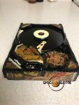
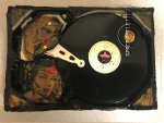
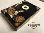
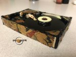
Someone gave me a really old Wonder Woman comic that wasn't worth anything, so I decided to do my thing. It had a super strong old library scent and historic ads, very nostalgic. It was hard to get a crisp look with this one, since I was dealing with fragile paper and a bumpy hard drive. It's probably been one of my better ideas, but not the easiest to execute.
Attachments
Ghost X
Moderator
It is interesting how hard drives complement other mediums aesthetically, at least where I've seen them re-used in art anyway. I've seen them framed in wood and all sorts, for example. Probably helps that they have a modern sleek look to them. I wonder if aesthetics was considered in their production, or if the general shape of them was by coincidence and is simply just economical.
Looks good. I think the roughness suits. Did you coat it in something, as I think that helps bring it together, whatever you did .
.
Looks good. I think the roughness suits. Did you coat it in something, as I think that helps bring it together, whatever you did
 .
.Rydeen
In-KWEH-dible
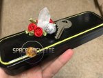
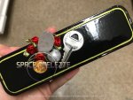
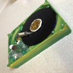
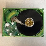
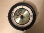
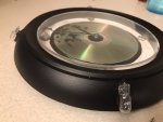
Eee, do you see that hard drive in the background of that pic of the lamp I took? I finally finished it today. 
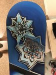
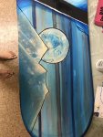
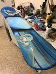
Also attaching a pic of the snowboard I did on commission for a cool co worker, but it wasn’t finished and I forgot to take a pic when I was done. I can ask him to take a pic when he varnishes it.

Also attaching a pic of the snowboard I did on commission for a cool co worker, but it wasn’t finished and I forgot to take a pic when I was done. I can ask him to take a pic when he varnishes it.
Attachments
Rydeen
In-KWEH-dible
That piece looks like a good conversation starter. Somebody looks up at your wall, believing from the shape that you have a clock on the wall, then suddenly realize it is in fact not a clock.
It actually is a functioning clock.
10/10, would have on wall.
Thanky!
I'm honestly running out of decent supplies, but I like to play this... game? with myself of never buying craft supplies other than paint and varnish, and pretty much everything else being either garbage or thrifted, just to see how far I can get with trash.
Prism
Pro Adventurer
- AKA
- pikpixelart
Whether just thrown together or not, it’s a very regal design for a clock, lol. The diamonds in place of the time landmarks are an aesthetically nice touch, and I always like shimmering metallic dials - so the CD looks pretty. I’m just curious what it would look like with a black PS1 disc as the dial.
Rydeen
In-KWEH-dible
So you just take random junk and make cool stuff with it? That's awesome.
Thanks. I do traditional paintings too, but I seem to have moved more strongly toward re-purposing junk for 3D art for the past few years.
Glaurung
Forgot the cutesy in my other pants. Sorry.
- AKA
- Mama Dragon
I'm honestly running out of decent supplies, but I like to play this... game? with myself of never buying craft supplies other than paint and varnish, and pretty much everything else being either garbage or thrifted, just to see how far I can get with trash.
It means you are saving a shitton of money in decor. And you get it to your taste. Win win.
Rydeen
In-KWEH-dible
I did another alcohol ink workshop today - this time with a focus on landscapes.
Trying to do non-abstract art with an unpredictable medium is a bitch. But it was a fun, challenging bitch. I’m about 65% happy with this. Not good enough to sell, but sort of good enough for a gift.

This is true. A fair amount of what I have up is my own stuff. They’re also good for gifts.
Trying to do non-abstract art with an unpredictable medium is a bitch. But it was a fun, challenging bitch.
 I’m about 65% happy with this. Not good enough to sell, but sort of good enough for a gift.
It means you are saving a shitton of money in decor. And you get it to your taste. Win win.
This is true. A fair amount of what I have up is my own stuff.
 They’re also good for gifts.
Last edited:
Torrie
astray ay-ay-ay
It still looks abstract enough to me, which isn't that bad, really. The "sky" looks magnificent. All these shades from greenish blue to light blue to purple. This picture wouldn't match my room design, but the longer I look at it, the more I like itTrying to do non-abstract art with an unpredictable medium is a bitch.
 Actually, it reminds me a bit of looking at old carpets up old Soviet bedroom walls - but not in terms of the design, but it's when patterns and swirls suddenly reveal a lot in your imagination.
Rydeen
In-KWEH-dible
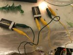
I have a bunch of these tiny halogen bulbs and the urge to incorporate them into artwork is strong (you can see them on the clock I posted above, but they’re not wired up), but they (obs) get hot (fire hazard) and need at least 9v to show the faintest light (below is 18v through series). Maybe I can buy switches and incorporate them into the work too. I could make a homemade switch but I’m not sure how safe that would be.
I have a string of LED lights left from a previous project, but I really love the aesthetic of the little lightbulbs.
Oops, forgot to reply. It is a happy accident. :p
I have a string of LED lights left from a previous project, but I really love the aesthetic of the little lightbulbs.

I'm drinking this alcohol with my eyes. Very pleasant to look at. Is it a happy accident that I see the Shire or is it happily intentional?
Oops, forgot to reply. It is a happy accident. :p
