You are using an out of date browser. It may not display this or other websites correctly.
You should upgrade or use an alternative browser.
You should upgrade or use an alternative browser.
SOTW 9 Voting Thread
- Thread starter DNA
- Start date
mikeylland
...
They are all nice.
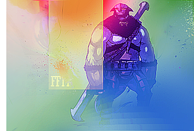
cmXT: if yours didn't have the white bar at the left, and the blurry light texture at top right it would look a lot better. i'd prefer it also if it was 3/4 of it's size. other than that, great composition and colours.
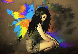
tangerine: gorgeous. the detail in the clouds at the right... uhhh.
dna: bitchin depth. where are the colours though?

I like all of them, but cmXT's entry got my vote - it's got a nice, smooth look to it and the way the different colors fade into each other is great, as is the blending of the stock.
KissTheRain
reality is a prison
- AKA
- jailbait
I'm for tangerine, the girl looks lovely and even better contrasted next your rainbow colors. :3
Celes Chere
Banned
- AKA
- Noctis
Very beautiful work, Tangerine. As per usual.


