Choose your menu bar

The options are:

  • Option 1

    Votes: 3 11.5%
  • Option 2

    Votes: 24 92.3%

  • Total voters
    26

Lex

Administrator
Following discussion in the other thread re: the colour of the text in the header bar, I present two options. Option one is the original which we've been operating with (people were having trouble with the dark text on screens), option two is a quick test one I've changed to/ activated. Easy peasy to change.

If you'd like to make other suggestions (option 3) you can use Chrome's inspect element feature to mess around yourself.

Option 1:

1534888459280.png

Option 2:

1534888483816.png

Personally I like option 1 but I'll abstain from voting :monster:
 

X-SOLDIER

Harbinger O Great Justice
AKA
X
Could you share what the hex values of the text & background colours on those two designs are? :mon:


X :neo:
 

Teioh

Pro Adventurer
AKA
Teiocho
Has Option 2 been put in bold? Or is that just the way the colour fools the eye into thinking the text is chunkier than it actually is? I like the darker colour of Option 1 but the chunkier text of Option 2 is definitely easier to read, for me anyway.
 

Mage

She/They
AKA
Mage
https://en.m.wikipedia.org/wiki/Near-sightedness

https://en.m.wikipedia.org/wiki/Astigmatism

http://meddb.eznetpublish.ihealthsp...tainerSrc=[G]Containers/_default/No Container

Links with information about why my eyes are borked and why the comment wasn't just about forum aesthetics. My retinal detachment was very close to the macula of my right eye (all about them cones, natch) and there's still scar tissue which affects how I see things. I know you wanted a specific design style Lex but I'm struggling with it and need to emphasise that this isn't taking a shit on your efforts. Neither option is great but 2 is a notable improvement.
 

X-SOLDIER

Harbinger O Great Justice
AKA
X
Links with information about why my eyes are borked and why the comment wasn't just about forum aesthetics. My retinal detachment was very close to the macula of my right eye (all about them cones, natch) and there's still scar tissue which affects how I see things. I know you wanted a specific design style Lex but I'm struggling with it and need to emphasise that this isn't taking a shit on your efforts. Neither option is great but 2 is a notable improvement.

This is actually the reason that I was looking for the colour hexes that we're using. My IRL job is actually as an accessibility QA engineer for software development, so one of the many things that I do involves testing colour combinations to find matches that're easier with people for any range of visual disabilities. It's one of the reasons that I'm such a big fan of us using a light text on a dark background as a colour scheme, since that's a massive benefit to preventing eye strain.

Contributing and advising on things like this to ensure that the largest range of users can utilize it with the smallest number of issue is literally what I get paid for, so I'm super into helping out for stuff like this, but I don't wanna step on toes and such when Lex's done the majority of the theming work thus far.


X :neo:
 

lithiumkatana17

Pro Adventurer
AKA
Lith
I'm not a computer whiz, but I'm just gonna say Option 2. It's just friendlier on the eyes in contrast the dark teal colors of the site.
 

X-SOLDIER

Harbinger O Great Justice
AKA
X
In case it helps while I'm offline, one of the online resources that's useful for checking contrast ratios for hex values and correcting the values to find something that's more a11y-friendly is this one here: https://webaim.org/resources/contrastchecker/ It makes it easy to move the values of the foreground/background colours to find something in a range that you like that still matches the style you're starting with.

General Rules:
• You don't want anything under 4.5:1 unless the text is really big.
• Contrasts between 4.5:1 & 7:1 are pretty solid for most folks.
• Anything over 7:1 is properly fantastic.


X :neo:
 

Lex

Administrator
Sorry x I'm at work, most sites have an eyedropper tool for colour hex values. Inspect element should also work.

@Addy Carver no worries mdear, I'm not fussed about having to change shit up IMO this is still a WIP and contrast is important.

Also yeah it's bold, we can play with the colours all we like really, it's a simple thing to mess around with. Like I said aswell, more than happy to take suggestions on colour for contrast. We could even think about a high contrast separate theme for the hard of sight?
 

X-SOLDIER

Harbinger O Great Justice
AKA
X
Sorry x I'm at work, most sites have an eyedropper tool for colour hex values. Inspect element should also work.

@Addy Carver no worries mdear, I'm not fussed about having to change shit up IMO this is still a WIP and contrast is important.

Also yeah it's bold, we can play with the colours all we like really, it's a simple thing to mess around with. Like I said aswell, more than happy to take suggestions on colour for contrast. We could even think about a high contrast separate theme for the hard of sight?

No worries. I can grab them for whichever one that's currently displaying (which I think was ~4.7:1), but pulling colours from screenshots have a frustrating tendency to artifact and slightly shift colours from their actual values, so I was wondering if you knew what the ones for both were.

Additionally, I'm a huge fan of having separate high contrast mode options where we explicitly check to ensure that all out ratios are >7:1. Having a default theme that's >4.5:1 is good, but that extra step is super helpful for users who tend to use other things like mobile view at desktop resolution to see. It's always nice to be able to apply good accessibility practices where we have the control to be able to. If that's a route we wanna go for another theme, I think that finding the main theme hex values that we want, and tossing them into a matrix like http://contrast-grid.eightshapes.com/ will let us know what limits they reach, and which combinations we could use against what, and what colours we wanna tweak.

Hell, while we're at it, I could always check out the things here and on frontpage with keyboard nav to see if we need to do anything to help ensure that computer users with limited mobility can navigate the news we post, or a screen reader to see how our site "looks" to someone who's almost fully visually impaired, and see if there's alt text, heading structures, or whatnot that'd be worth cleaning up. :mon: (If it's something we wanna do, I'll make a separate thread for it, and make a list of things what'd need addressing).


X :neo:
 

Lex

Administrator
Feel free to make a child of the current theme on the test site and build a 7:1 theme yourself in that case, always good to have options :monster:
 

X-SOLDIER

Harbinger O Great Justice
AKA
X
Yup. Will try to set it up and pick through other stuff with regularity (since that's something I'm slightly more capable of now) :awesomonster:


X :neo:
 

Cthulhu

Administrator
AKA
Yop
I had a school project once and it was like the first time I did any serious coding and the teacher said something about high contrast and that yellow on blue gives a high contrast so we made a monstrosity in blue on yellow or vice-versa and it was terrible and :closedmonster:

erm, I mean, carry on
 

Lex

Administrator
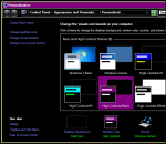
When I had Windows pre-XP (showing my age) I used to use the high contrast theme just because it looked batshit crazy.
 

X-SOLDIER

Harbinger O Great Justice
AKA
X
When I had Windows pre-XP (showing my age) I used to use the high contrast theme just because it looked batshit crazy.

I did the same thing, actually. :P Back when I worked for Dell's tech support in the XP days, we used to turn on HCM and flip peoples' screens if they didn't lock their computers when they walked away from their desks, because it was jarring for them to come back to (and also it was two really quick keystrokes to accomplish).


X :neo:
 

Fangu

Great Old One
idk I think it's a bit odd we're not saying accessibility should be default, but that we have to vote over it. I'm all for following web standards in any way possible.
 

Mage

She/They
AKA
Mage
^ So much this.
Also high contrast isn't necessarily better with some sight problems - in my case bright white can cause migraines, which is why Twitter's night mode is glorious and even my own shit website is black and pseudo-gold (strong contrast but not stark). As an example, the Windows 10 high contrast for me is unusable.
 

Lex

Administrator
I mean in principle I agree but tbh I don't want to plow ahead and make changes without consent/ chatting about it first. Flavour of the month goes from "YOU MADE CHANGES WITHOUT CONSULTING ANYONE KNOW YOUR PLACE" to "why aren't you making changes you useless piece of shit" so fast it's making my head spin (this is not directed at either of you, just something I'm wary of from past experiences).

Accessibility is the default. AFAIK the only thing that was fairly low contrast is the thing we're voting about in this thread. My suggestion to X to make a high contrast theme is for people who need the complete eyesore of high contrast to comfortably read TLS.

who remembers this but in 1997:

1535043223712.png
 

X-SOLDIER

Harbinger O Great Justice
AKA
X
idk I think it's a bit odd we're not saying accessibility should be default, but that we have to vote over it. I'm all for following web standards in any way possible.

Oh no, that's not what I meant. I really want to fix accessibility things that we can do, which is why I brought it up.

The 4.5:1 is an accessibility standard for visual, and anything below that we should totally change that applies to our general visuals – Both in the forums and on the main page.

There are a LOT of accessibility standards for various levels of compliance, and if I'm looking over it, I'm gonna check against literally everything that WCAG 2.0/2.1 requires that we could reasonably achieve. It takes lots of time and effort to get through that, since if I'm doing it, I've gotta dive DEEP on it, since accessibility auditing is quite literally my job and I can't only partially poke at it. That being said I'd need some help with doing a full look, since most of what I do is the auditing and I haven't been responsible for basically any of the forums/main site coding and customization.


X :neo:
 

Mage

She/They
AKA
Mage
@Lex I don't think anyone would be pissed at changes that improve accessibility. The offline comparison to that would be whinging that ramps outside of buildings make them unsightly and that puts you on a par with Toby Young for even thinking it (Google him if you don't know of him, he's repugnant). :monster:

I haven't noticed anything else I'm struggling to read on here but I do use mobile a lot more now it's so improved so if I find anything I'll let you know.
 
Top Bottom