New TLS Front Page

Fangu

Great Old One
Setting up tools, continued

- Installed Eclipse for PHP development (Build id: 20100617-1415)
- Installed Remote System Explorer End-User Runtime (Accessible to download from Eclipse itself)
- Tested with FTP connection - shit works.

= I can now edit the PHP files directly on the server (with the goodness of colors and other stuff from Eclipse) for much smoother and faster testing. Will of course do decent backups before every work session so I can rollback if necessary.

Optional TODO: Find a way to us GIT or other version control systems in between all of this. Probably smart to do this when starting on the _real_ thing.

Edit: The test server is soo sloooow... (10 seconds at least for a load). Yop, is there some crap (forum related or w/e) you can delete to speed it up? :P

Edit 2: Test site looks The Hell right now, but all I did was change themes. Fucking around with the child theme right now to understand how stuff is glued together. I have to do boring IRL stuff right now, will continue later. PS - the test site should be hidden from Google, dunno if this is taken care of.
 
Last edited:

Fangu

Great Old One
Thanks. I have RL stuff to do today but I'm itching to get back onto it, will probably get some work done later. Fiddling around with sidebar dynamics and CSS right now. Actually I dreamed about float: left last night :lol:
 

Fangu

Great Old One
Shademp, I've been fiddling around with the navigation for the test site. What strikes me is that if we're to keep the header banner at 1024 px, as it is now with both Front page and forums, and still use two sidebars, the content space will be very small. I've done a 1280 version that looks a bit better (more space for content), but after reading some of the stuff you posted in the TLS GFX page, I get the impression that your main idea is to separate Fan content from Franchise content, and that keeping 2 sidebars is just how you've thought is the most effective way of doing it. Like with this photo. But taking that photo as an example - would it be so bad to have all the sub menus in the two sidebars kept in just the one? Or do you really want to keep the 2 sidebars? Because I spent some time adding them into a Twenty Eleven child so they're editable from the WP Admin panel, as in I already did the work, no problem keeping them. But we might have to do something to increase the space for actual content. If you look at Chrono C, they're site uses the entire width of the browser. If we're to use 1280, pixel will have to redesign his header and stuff. Also, it would affect the width of the forum.

Sorry for the block of text, I found no clever way of paragraphing it :lol:
 
@Fangu

The issue of the limited width for content has bothered me as well. Both my UT articles and the Index Pages (which I am working on right now btw) suffer from this.
I want to differentiate between Franchise and Fan content, but we can probably find a way to do this without needing sidebars on both sides. So from my opinion, do what you must to make sure that we get more space for the content window. ;)

EDIT:
If we're to use 1280, pixel will have to redesign his header and stuff. Also, it would affect the width of the forum.
I can't really visualize how the forum would change, from what you just described. Personally, I would not care so much if the forums changed. Might be a good idea to check with the rest of the forum staff first though if they are ok with any changes that comes as a result of your work.

Anyway, priority is to have more width for content so if you know that this can get done I think it is worth to pester Pixel to do some redesigns.
 

Fangu

Great Old One
:salute:

Will work around 1024 in the first place to see how that works out. It's not a bad width at all, as long as the content is given enough space. I like the narrower designs.

I've discovered that WP 3.3 has some nice features for different Pages (having a 'parent', custom template for a type of Pages etc) so using Pages still might work pretty well. Also, making the template dynamic is also working out nicely. I'm quite enthusiastic about all of this right now, I just have to get some RL stuff out of the way so I can focus 110% ;)
 
Just to give an idea of the scope, here are the pages/posts I imagine to be made public alongside with the new Front Page:

- Staff List

- Franchise Guide
- Canon of FFVII
-- "Present Status of the Compilation" (article)
- FFVII - The Original
- Advent Children
- Before Crisis
- Crisis Core
- Dirge of Cerberus
- Novels & Novellas

- Crossover Titles
- FFVIII & FFIX

- The Lifestream Audiobooks
- TLS Commentaries
- Essays & Analysis

Tres is responsible for Essays & Analysis.
Ryu takes care of TLS Commentaries.
I've collaborated with Pixel to make the The Lifestream Audiobooks page.

The page "FFVIII & FFIX" will hold the respective Ultimania translations for these titles. I will continue to envision TLS as an FFVII site, but naturally I will keep an eye out to make sure we have proper indexes for non-FFVII content.


-----------------------------------------------------

Then, the pages I see become completed shortly AFTER the redesign is made public:
- Affiliations
- Parodies
- Fan Fiction
- Main Page

- Affiliations will be post-poned because I'd rather we wait with contacting more sites and peeps until after the redesign. We want to catch attention when we look all professional and organized.
- Parodies I could make a short stub for, just to attract attention, but ultimately it will need a leader with a vision on how to structure this thing.
- LicoriceAllSorts will at some point make the Fan Fiction , as she is the appointed leader of it, though it may take a while.
- Main Page I envision to be a sort of "Introduction & Navigation" page. Very brief statements about what TLS is about and where certain material can be found. Sure, this would fit nicely as a page to include when the redesign happens but I need to place a limit on my work load at some point. :P

EDIT: Just remembered that we should not begin the new Front Page completely lacking an "Affiliations" page of course, so a short one containing the already existing affiliations will be published. The point is however that after the redesign happens I will make sure that the Affiliations page is updated.
 
Last edited:

Cthulhu

Administrator
AKA
Yop
Ideally, you'd have a responsive web design where you get just a single column on, for example, mobile devices and four columns (or w/e) on huge 1200 px or higher screens. But that's a lot of work, and I cba with css atm :monster:.

(there's a decent chance I'll be doing a lot of CSS at my new project at work btw. Do not want, but then, I'm probably the most qualified :monster:. Land of the blind etc. )
 

Fangu

Great Old One
Ideally, you'd have a responsive web design where you get just a single column on, for example, mobile devices and four columns (or w/e) on huge 1200 px or higher screens. But that's a lot of work, and I cba with css atm :monster:.
Wordpress has solved this problem for us. It comes with automatic minimizing of headers. It also puts the sidebars at the bottom if the browser window is minimized a lot. Check out Twenty Eleven. It's super awesome. For each large step I do, I test it on my cell phone as well. (I should also mention 3.3 comes with a mobile skin. Once we've decided on the navigations stuff I'll look into the mobile skin.)

I'm trying to raep the core of Twenty Eleven as little as possible. I want the Child Theme to have as few lines as possible. The CSS is so tiny and clean right now it's almost making me horny.

There are such good ways of adjusting your wanted custom look by just tickling the outside of the code and leaving the core be. I'm trying to do as much as possible by using standards and hardcoding as little as I possibly can. If I can make a widget area, there will be a widget area so anyone with Admin control can edit the shit out of it. The only site I plan on jerking off PHP hard and steady is in my custom frontpage template, which spits out index.php at the moment. I'm going to image resize and loop and fuck around so hard, wooooooooooo
 

Fangu

Great Old One
I feel fucking accomplished.

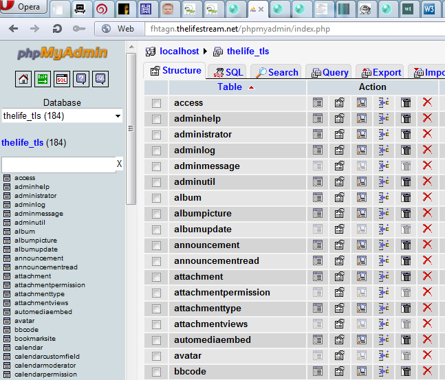
phpmyadminw00t.png


--> apt-get install phpmyadmin
--> exchange /etc/dbconfig-common/phpmyadmin.conf with something random I found online
--> update the htpasswd file for the standard user (htpasswd -c .htpasswd theuser for future reference) for double security
--> restart Apache2

Et voila. I managed to install phpMyAdmin. It only took me 6 hours :lol: But I did it. Do I need it for anything? Yes, it's awesome for writing the code I want to write in order to be able to extract threads/stuff from the forums to the new Front page. phpMyAdmin gives an awesome overview.


Regarding Front page test site: I'm working on 3 things basically:

- Adjusting the CSS to look good on iPads/pads and cell phones. Basically this just means fucking to a minimum with the Twenty Eleven theme because it has a lot of cool features for this already.
- Figure out the basics of extracting stuff from the forums to the Front page. (Imagine stuff like "the 10 latest threads from our forums".)
- Get a good overview of Shademps contents and go through his suggestions and wishlist again to make sure I'm on the right track.
- Fiddle with the Front page code to come up with examples for a look.

TODO:
- Edit the mobile skin included in Twenty Eleven. This will probably pushed way back as we need to figure out how we want the Front page to look first.
- Update the documentation.

Most of this should be done by my self set Update date: April 10th.
 

Cthulhu

Administrator
AKA
Yop
You could've just uploaded it with ftp, :monster:. Great justice btw. Also, that adaptive style is a winner; I just hope we can make it work decently with the popup navigation (if we're still going with that - a valid and adaptive-compliant alternative would be a big navigation section in the footer).
 

Fangu

Great Old One
You could've just uploaded it with ftp, :monster:.
I have to admit I really didn't think of that. My plan B was to download the package with a command line and install it manually if all else failed. I guess FTP would be much more handy if so. I still would have to install it though. When the apt-get works it's such 1337 win.

Great justice btw.
:joy:

Also, that adaptive style is a winner; I just hope we can make it work decently with the popup navigation (if we're still going with that - a valid and adaptive-compliant alternative would be a big navigation section in the footer).
Yeah, I'm leaving that be atm because it would be a little project in its own.

What's a bit weird is that the current menu don't work on iPad. I'm assuming it's some div/ element overlay (hidden) or something that I did in the custom CSS that's causing it, because it works fine with the Twenty Eleven demo.
 

Fangu

Great Old One
Front Page Project Update
April 12th


Stuff in italic is progress


CONTENT
  • Get a good overview of Shademps contents and go through his suggestions and wishlist again to make sure I'm on the right track. I need to go through his content to see if we can still use Pages, as the ongoing plan is. This is a coming priority and is vital to the project.
  • Learn and get a good idea on how Pages works in WP. Find out how dynamic it really is, and if there are additional features in WP 3.3 that lets us use this feature nicely.

DESIGN
  • Make a Child Theme of Twenty Eleven, and import CSS from The Lifestream 3 (the old WP design by Cthulhu and Pixel). Almost done, missing text styles, so everything is blue links and stuff.
  • Triple test all DIV elements, so it all floats nicely in the major 5 browsers + handles browser window resizing.
  • Adjusting the CSS to look good on iPads/pads and cell phones. Basically this just means fucking to a minimum with the Twenty Eleven theme because it has a lot of cool features for this already. There are two @Media sections which is triggered by pads (800px) and for cell phones (even smaller width). This will probably pushed way back as we need to figure out how we want the Front page to look first. I've done general testing and the new front page looks nice on cell phones in "normal mode" (as in "not cell phone mode" - as of now a cell phone skin is triggered, and as index.php now points to a Page, just the content of this Page is shown, and not the funky code that shows up in a normal browser.)
  • Fiddle with the Front page code to come up with examples for a look. I've done a very basic outline for a "preview section" for Posts. I will make something similar for Posts, or the two can be integrated. I've sent the test site link to Shademp to make sure I'm not completely off his vision to put "teasers" on the front page.
  • Come up with good ways of including the different types of content on the Front page, so it doesn't look completely like a newspaper...
  • The top menu is to be replaced with Pixel's imagery when that's done. It must be integrated as a part of the WP design so it resizes like the rest of the site.
  • Fix the remaining major WP content outtake sites (archive.php, single.php, author.php and so on) so they work properly with a sidebar. I'm gonna get on this now, because it's a really irritating thing to look at.
  • If Pixel or Yop wants a copy of the CSS, scream! (I promise you I'm trying to make it as neat as possible)

INTEGRATION WITH FORUMS
  • Figured out the basics of extracting stuff from the forums to the Front page. (Imagine stuff like "the 10 latest threads from our forums".) I managed to take out basic info from the old forum databases. It'll be easy to make simple queries like "10 latest thread" with titles and latest poster etc. Suggestions?

CORE - "THE CRAZY LIST"
Mostly for my own enjoyment
  • IMAGE HANDLING
    • Make a feature in the Admin panel so when making a new Post or Page, you get to choose which attached photo is the "Preview" photo. That, or make a new section in the Admin panel that lets you pull out a Post or Page by title, and lets you choose which of the attachments to use. I've written a functions that puts all related attachment of a Post into an array.
    • Make a function where the correct size of said Preview photo is printed in the correct size on the front page Preview. Found WP documentation of how to make an additional image size (in addition to 'thumbnail', 'medium' and 'large'. Will use that for a new type of image resizing to match the previews. Note: Use built in feature for Header cropping?
    • Make a funtion that searches a text string for the first img HTML tag and uploads it as an attachment, as a lot of posts don't have attached images, but instead the author has used an img HTML tag. Found the core code for uploading new images.
    • If time/ later: Make this as a plug-in for easy disabling and enabling for WP Upgrades.
  • STUFF THAT DOESN'T WORK ATM/ PORBLEMS
    • Figure out why the hell the existing top menu isn't working on iPad when the Twenty Eleven CSS has barely been changed and TE works fine on iPad. (Overlaying DIV?)
    • Figure out where in the original Theme it's indicated that the float:right is to be pushed at the bottom when minimizing the window, and not to the top. (CSS standard?)

Documentation is here


Input wanted!

I think it would be good to get any type of input. Any! Like, what kind of stuff from the forums is interesting to show on the Front page (as in the page you see when you go to thelifestream.net)? What kind of social media should be on there (if any)?

Have you heard specific stuff from non-forum members regarding the Front page that is useful to this project?

In all shortness - what would make you choose the Front page as your starting page instead of the forums?

Next update: Friday April 20th
 

Flintlock

Pro Adventurer
In all shortness - what would make you choose the Front page as your starting page instead of the forums?
In all honesty, I don't think anything could. That's why I would like to see more front page integration on the forum, as well as the reverse, as I mentioned not long ago.

Having the ten most recently active threads would be a good start for the front page. Displaying the number of currently active forum users might be a simple way to create a feeling of activity. Other than that, I'm not sure.
 

Fangu

Great Old One
Having the ten most recently active threads would be a good start for the front page. Displaying the number of currently active forum users might be a simple way to create a feeling of activity. Other than that, I'm not sure.
That would be awesome. Though, this is where it starts getting tricky, and this refers to your first paragraph. Only logged in users can see who's online. Primary this means sessions on the Front page will have to be integrated with the forums - and as has been repeated numerous times: vB is not easy to crack. There is sessions and crap to consider. It would take a serious amount of testing, because we're not only talking pulling stuff out with a read-only database user; we're talking the security of the forum users' accounts.

There is an alternative though. By setting up a dummy database and/or forum user who's rights is set to 'standard', querys from the database could be made using that user. You would still however only see the users that is set to visible (admins would have to log in through the forums to see everyone) and this would also mean that guests would see the forum users online that aren't set to visible. I don't know if anyone feels this would be bad.

Other than that, I'm not sure.
It's not easy to imagine, is it. Stuff like "hottest topics" could work. I really have no idea. I stink at two things: Graphics, and being totally creative. I guess they are related. :P
 

Fangu

Great Old One
Yop, this project needs you to install FTP on the new server.

I can't think of any valid argument you might have to not do it, except being lazy. :P
 

Fangu

Great Old One
I promised an update April 20th. Here's the update. I'll keep it short this time.

  • Shademp and I are workshopping over PMs. It's mostly about content ideas and too random to bother posting here. But it's looking good.
  • Still no FTP on the new server :P
  • I have exams coming up and since we need time for a proper revision before the 1st launch, I'm starting to think May is a bit too early. In June I'll have shitloads of time. It's not like I'm doing nothing on the test site because I am. Not everyday, but often. During the Race, a lot of good ideas came up for the Front Page, and of course as many of these as possible should be fitted into the project.
  • I've redone a lot of stuff to make the amount of new code as tiny as possible.
  • I've noticed even the existing TLS has a mobile skin. (Did anyone notice that yet? Should it be switched off?)

Windows broke some RSE settings for me when I reinstalled my disc. I'm looking into that now so I can keep going. Edit: I figured it out. It wasn't a Windows file problem. It was the Windows Firewall. Of all things. I got a hint that that could be it when snooping around for a different IDE to use (Netbeans). I changed my Firewall settings to let eclipse communicate through 'public networks', and that did the trick. I can't believe it solved the problem but it did.

I haven't done anything on this project for 5 days, and I really needed the break. I was seeing double last Thursday. But I'm going to continue now.
 
Last edited:

Cthulhu

Administrator
AKA
Yop
You work too much, woman :monster:. Should I perhaps set up some development tooling so styling is a bit more direct?
 

Fangu

Great Old One
Nah, that's not needed, but thanks. The two things on my wish list are:

- PHP error message tool for the new server ("error in something.php on line 22" etc)
- FTP on the new server

:desu:
 

Cthulhu

Administrator
AKA
Yop
Probably because showing errors to end-users is user-unfriendly and a potential security risk? :monster:
 

Fangu

Great Old One
I dunno, WP is still open source? But yeah, it does make sense. Anyway thanks. Had I been clever I would have googled it, but my mind was so set on the thought that this had to be something server related you had to install. Never struck me that it might already be installed with PHP :monster:
 

Cthulhu

Administrator
AKA
Yop
Or, be a language feature, for that matter :monster:. You should work on your general PHP knowledge (or actually no, you should forget everything you know about PHP and use a real language), read some good articles (i.e. anything not on w3schools or random blogs or the official documentation) about it, and, most importantly, ask and listen to me a lot :monster:.
 

Fangu

Great Old One
Why didn't you bring this up the first time we talked about it btw?

Also, w3 is actually a useful resource for HTML and CSS. It is a official source, yeah, but since they make up the rules, why not go directly to the source. I don't use w3 for PHP functionality?
 
Top Bottom