Shademp's Amateurish Creativity Blog

The two paint programs (not counting the basic for-children Paint) I now have *some* experience with is GIMP2 and Paint Tool SAI. I left GIMP because it was too much of pain in the a$$ when I tried to perform...anything.

Up until just now Paint Tool SAI felt better. While I did express a nigh existential crisis at the face of the hue wheel, the truth is that I find it a lot more intuitive than the RGB slides. In those slides, I have no intuition AT ALL about how to find the color I am searching for. With the Hue Wheel and the Saturation/Value square, I could somewhat zone in on for example a gold color by moving to yellow on the hue wheel and then moving around in the square. Same with the quest of finding correct tones of blue, blue-ish silver, brown etc.

But now SAI is acting the show-stopper. I am doing my darndest to create a repeating pattern, but there seems to be no way at all for me to copy one part of the layer into another part of the same layer.
mtBV5EU.png

Working on a 252x252 canvas. I heard from Dipsiel that SAI is not really meant for pixel-art, but that it should work fine for my purposes.

Every time I copy something using the selection tool it just copies that thing into another layer. I can't stress enough how much I hate layers. I hate them so much and I want to kill all their two-dimensional family members and friends until there is ONLY THE ONE LAYER LEFT!

Sure, I can understand the principle. My goal here was actually to start building a pixel-version of my living space. When I get to the point of making chairs etc, maybe I want to make them on a separate layer, then combine that with the basic room I have on the first layer, to see how well the chair fits. But yet again the software acts as a show stopper because I am not allowed to copy-paste the repeating pattern of the floor tiles. How do I shot web copy-paste the way I want?


There are so many things in these drawing/painting programs that act contradictory to what I am used to. Like for example the nigh impossibility of creating a SQUARE eraser. To me this is a basic feature. The inability to create one kept me busy for a long time in GIMP and annoyed me greatly in SAI yesterday. Instead I have to use deletion with selection tools, color replacements with the brush of my choice (in this case, "Binary", because pixel art) and some tricks with transparency (which I seem to have forgotten how to do).

These programs are just so bloody counter-intuitive. It may be that the biggest foe I face is adapting to the software, rather than the foe of considering myself an unworthy inferior creature for even considering the possibility that I could create decent art.


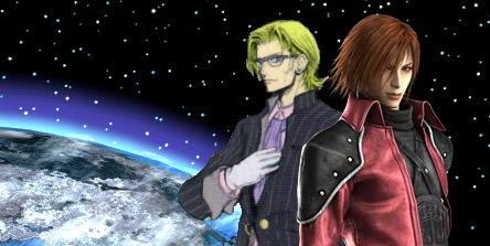
To bring up an example. I struggled for over an hour just to activate the right transparency tools in GIMP in order to create transparency around the official Lazard (Crisis Core) artwork. Even then my purposes were never fully met, because I was unable to create a true "binary 1x1 pixel" size marker to create instant transparency wherever I wanted. I struggled and struggled but had to settle with a 2x2 marker that only created full transparency after multiple clicks.

In the end I managed to create a lot of transparency where I wanted, but the actual fine-tuning which made it look GOOD was when I imported the image into Paint (the one "for children", or whatever professional artists call it, that comes naturally with Windows) and managed to copy-paste darkness into proper spots.
surnames_planet_featured_fixed.png

These technical difficulties make me so angry I can't control myself. Give me a decent chance to create a piece of art so I may shun it, at the VERY LEAST!

EDIT: I made the *slight* progress of finding a way to move the copied rectangle on the unwanted second layer so it matches with the first layer, than I merged both layers into one and finally got that bit copied. Is this how lengthy the process is supposed to be?!


EDIT #2: After some merging layers over and over, I've created the following.

Ks5kJMY.png

After creating the rectangles I used the crayon "brush" to form the "undecided patterns" within each rectangle. As you can tell the first four rows were copied over and over, but I tried to break some of the patterns by retouching here and there with the crayon.

The idea was to recreate my floor, but it ends up looking more like an oddly colored wall because of
1) lack of references (objects and scale)
2) the rectangles are in fact too large. They should be smaller.

Link: This is the actual floor of my living room.

When creating the "floor tiles" I had in mind the seeming mess that is many of the floor tiles in Chrono Trigger.
X2dV3Hh.png

I didn't at all replicate this of course, but seeing how good pixel art can look even with its messiness, that is why I felt confident picking the crayon brush.


FINAL EDIT:
- Here is what the room currently looks like.
For the first time ever I am actually *using* layers.
 
Last edited:

Obsidian Fire

Ahk Morn!
AKA
The Engineer
It shouldn't be that hard to copy/paste onto the same layer...

I don't use SAI, I use GIMP, but all you have to do in GIMP to paste onto the same layer is hit the copy short-cut, do the paste short-cut, move the pasted part to where ever you want and then click outside the pasted area and it ends up on whatever layer it was copied from.

As far as making a 1x1 pixel brush goes, in GIMP I'd just use the normal round brush, change the size to 1x1 and make sure to use the Pencil tool instead of the Paintbrush tool. I'd do the same thing for the Eraser tool, but in GIMP there's an option for the Eraser tool called "Hard Edge" that I'd click on, that option makes the edges not fuzzy. Actually, the Pencil tool is just like the Paintbrush tool, except it behaves like "Hard Edge" is always on.
 

Dipsiel

Proper Fool & Aspiring Artist
AKA
Dipshit, Dirty Hooves
until Dipsiel informed me that square erasers just "isn't a thing you normally do/use" in professional paint software.

No no, don't put words in my mouth! What I said was that the program is designed with traditional style painting in mind, and thus there was not that much call for a square shaped brush in the standard brush setup. I also said that I personally don't ever use square brushes for my drawings. Don't let your frustration twist my words, rawr! There should still be one though. It's not like it'd cause UI clutter with just one square brush in the default file.

As for the paste into same layer, I do agree that it should be an included feature, but I'm just so used to merging with ctrl+E immediately when I need to do that, so it doesn't really take any extra time. Still though, it is a silly feature to leave out.
 
The "success" of working on the pixelized version of my room is filling me with too much excitement regarding the potential of what I can create, given a good amount of time. Unfortunately this is keeping me from sleep. :P That's going to punish me tomorrow. Indeed, this overconfidence will probably punish me later on, bringing me down to earth.

Even so, the truth is that while working on that pixel stuff...I *felt* something special. This is significant.


@Dip

Sorry about that. *(Has now edited away the error).
 
Continued work on the pixel-version of my room:

OOfaU1l.png

X48V4an.png

I clearly like what I see better when zoomed in rather than the "default" zero zoom size.

- What you see to the bottom right in the first link is a scrapped texture for the furniture. That texture was made with the use of the crayon brush, while the current ones were simply me "randomly" clicking and making strokes with three different color tones. I sense that there's some BIG SECRET ON HOW TO CREATE PROPER TEXTURES that I am yet to figure out. There has to be something more to it other than just handling 3+ colors and then clicking randomly on the surface until you get something that looks decent when zoomed out.


- Creating the computer keyboard was a fun challenge, because you have to catch the "idea" of a keyboard, rather than copying it exactly. I sort-of managed to prevent the chess-board feel on it, but not completely. Even so, I think it turned out decent. Breaking the chess-board pattern by clearly showing the wide "space bar" adds a lot.


- I haven't paid much attention to how big objects should be relative to the character sprite I wish to include. That's what the "char space" down at the right is about btw: A marker for the 32x64 pixel space that I want the sprite to occupy at the most. I'll probably just make the sprite into a version of me, but with sunglasses. ;)


- The learning process is actually fun at times, trying to figure out what effect will work best. It's also neat to study the works of others to see how some effects might be achieved. For the glass doors I opened up a New Game of To The Moon (THIS GAME IS EXCELLENT BUY IT NOW OR PLAY THE FREE DEMO FOR THE LOVE OF ALL THAT IS HOLY) and looked how that one did its glass.


- Creating the outlet (see wall to the left) was a bloody nightmare! I still haven't got it down perfectly. Even the attempt at a depth-effect wasn't that successful. I made so many versions of this one but never got a satisfying result.


- Speaking of 3D effects, one of my proudest moments was the sense of height at the back of my desk. It can only be appreciated in the zoom-in version of the image. Also like the sense of depth at the bottom of the desk, but there I had some trouble with choosing the shadow effect. I actually did not want to include the desk leg shadows on the floor, but adding the small shadows at the very top of the legs just wasn't enough.


- I can see the benefit here of trying to make a fictional room, because my room isn't very colorful. Trying to find contrasts within very limited values and saturations was not easy. As you can see the top of the desktop lamp blends in with the wall. In order to create contrast, I have to ignore the actual whiteness of many objects (like the lamp or the outlet).


Working on the furniture for so many hours has left me a bit bored (ergo why I post this incomplete image and talk about it instead of continuing the work). Eventually my mind went blank and I felt like I was just "filling in the colors" rather than intellectually figuring out new methods. While I always have the hue wheel and saturation/value square present, I use the HSV bars to death when trying to find transitional color values. Initially I felt smart for this but now it just gets kind of boring.

Making art involves a lot of initiative, I reckon. Break from the norm and try something new. Maybe I should use the RGB bars, but man I can't predict or understand that one at all, currently. The HSV bars feel like you are just fine-tuning two bars. RGB is like fine-tuning hundreds of bars.

Anyway, looking forward to creating some more objects and trying out some other effects I have in mind. If I learn the ways to create proper texture, then that will be a reason to open up the champagne.


EDIT: Today's recommended music piece - Konata Healing Springs!
 
Last edited:
Health & Creative Endeavors

If you pull the string too tight, it will snap. If you let the string too loose, it won't play.

Optimizing art performance and pursuing healthy habits go hand in hand. Indeed, no matter the craft you are practicing it is of utmost importance that you keep body and mind healthy with routine exercise. Today, I sensed that an overabundance of sugar yesterday had the after-effect of weakening me even one day later, making me much more susceptible to negative thought and emotion. I have thusly chosen to eat many fewer sugary sweets next weekend when compared to this weekend, when I honestly went slightly too far.

I can hardly wait to return to the gym on Monday, Wednesday and Friday. It can't be stressed hard enough how important these sessions are for building up the mental barriers that allow me to pursue art experiments without being weighed down by despair. Physical exercise also has cured me of my back pains. There is NO CHOICE for me but to continue exercising. I have done so for 11 weeks in a row now. The only downside is that keeping this routine requires much mental effort. I can't "just go to the gym", without making a huge deal out of it both in my own mind and in idle conversation. It *is* a stressful thing to keep this routine going, though in the long run it pays off with an improved ability to handle stress.
---------------------------------------------------------------------

THE BLACK SOFA
Right now I am working very hard on recreating my sofa in pixelated form. So far it feels like my greatest challenge yet in this pixel venture. Even when I return to it later on when my mind is at maximum capacity, I don't expect it to be easy. The sofa is completely black. All I have to work with are dark shades and some light reflections. With the pillows, arm seats, seats and the transitions between all these, it's a dark mess. I started to look at how To the Moon and RPG Maker does beds (they don't seem to have sofas, so beds are the closest thing I could check) but these were too frightening to look at. The skill and thought behind them were too advanced, that much I could tell.


The effects of eating too many sugary sweets is starting to wear off. My mental barriers are building up again. A few fears still cross me though. What if I quickly hit a "learning roof", where I can't get any better at pixel art? What if this is all wasted time?

Well, a sentence that I keep repeating to myself is that "Every time is wasted and every time is earned". Pursuing one path means an infinite number of other paths are left unexplored. But choosing to do SOMETHING, whether it be for only a few hours or for many years, is much more valuable than contemplating how much you may lose by being adventurous and courageous.

I can't deny the possibility that I may indeed hit a learning roof and that my brain can't evolve to become really good at pixel art. But I also can't deny that fearing this right now is a complete, utter waste of time.


Some random notes and clips before finishing up this blog post.

Downsides with Paint Tool SAI:
- You are not shown coordinates or the exact, numbered size of any marked area. You need to count pixels yourself or find other methods when striving for specific lengths. This is where GIMP is actually better.
- Copy-pasting can only paste the thing into a new layer. Fortunately, the new layer can quickly be fused with your current one by pressing Ctrl + E.

Upsides with Paint Tool SAI:
- Starts up VERY quickly. Almost no waiting.
- Has much more straightforward tool interfaces, in my opinion, compared to that of for example GIMP. It appeals to my amateurish mind, at least.

Other Notes
- Currently working on FIVE layers for my pixel room. Just a week ago I would never have imagined myself working with layers. :)

- You can set a layer's default mode, to for example "luminosity" where everything on the layer gains a certain transparity. I chose to create a lighting effect "manually" instead though and it actually turned out better than the short-cut luminosity effect.

- I couldn't have made this much progress today without the help from my friend Dipsiel. I know I keep going on and on about Dipsiel in these posts, but he is a really helpful support, art teacher and friend.


Trying to figure out how to make this pixelated sofa feels like being back in school and trying to figure out math. For that reason, this clip is relevant. It's that math/physics-related feeling of confusion all over again, but now with art.


I'm feeling confused, limited, somewhat-stupid with a small flicker of despair. There is also a sense of hope though. Learning may not always feel fun, romantic or exhilirating. In fact it may even feel like eating bread without butter. But at least there is the pay-off of learning something, rather than nothing.
 
Alright, here it is. Pixel-art version of Shademp's room, version 1.0.

NvhA10u.png

6X4iqcY.png


The items at the very bottom are unused stuff (aside from the "Character/Sprite Space" reference box).

- Old top-down version of sofa. After having made it I realized I forgot the essence of pixel RPG-type art: The 2.5D perspective. The back of the sofa should also be visible. Unless an object is completely flat or pressed against a wall at the bottom, both the top and back should be visible.

- Unused piece of papyrus paper. Tried to make a paper that was laying down at an angle, but failed and accidentally made a papyrus.

- Original texture for the brown-ish furniture. Created by applying the Crayon brush and smoothing things out. Didn't like the feel of it so I went with a manual solution instead, adding different color tones at random on a surface.


Creating this room was a 90% great experience. The other 10%... Well, demanding to *always* have fun would be a bit too much, wouldn't it?

The first thing I did wrong was to not properly measure the proportions of the room. The room should be about 20-25% smaller in width to reflect the actual room, when using the current objects as references. Should have considered scales and the intended character sprite size from the beginning. I'd much rather create a completely new room though than to go back and change this one.

At the very end I re-discovered (yes, about a year ago I actually did one or two pixel-art experiments but then immediately dropped it) the guilt-filled joy of making texture look better(?) by scaling up or down a piece of manually made texture. The spectrum of value variations become much greater than anything I could hold in my own mind. I can keep track of three, perhaps four, color variations TOPS. Scaling up or down suddenly expands the number of present variations to 10-20. Maybe doing this is considered a cardinal sin among pixel artists... Is it?

I could comment on this fun experiment at great length, but I won't try the reader's patience. Instead, here's a little easter egg. If you remove the table you will see the text...
owqIfuh.png


NEVER GIVE UP
 
DO NOT PANIC

IT IS NOT MAGIC


These large friendly letters are printed inside my mind's eye as I explore Adobe Photoshop CS6. Yes, currently I have moved away from Paint Tool SAI, due to it having no clear referential grids or other ways to easily count the pixels. I was also unable to find a function for TRUE transparency in Paint Tool SAI, but maybe that's just me being sucky.

Fear often prevents me from installing new programs. I fear the computer will explode and unleash some elder demons that will steal all my coffee. You know. Typical fear of the average world citizen.

With the SAI experience behind me, I feel decently confident with Adobe Photoshop. I have accepted that painting programs act differently and that the adjustment period doesn't have to be one filled with frustration. Exploring different programs is part of the adventure, really. I am not sure if Photoshop has all that I need or if it's the most optimal option, but I will play around some more first. Maybe there is some streamlined "pixel graphics" software out there that I can find by simply typing in the google search bar "streamline pixel graphics software", but I don't want to get ahead of myself! Want to try out Photoshop first!


Doing art really is about initiative and courage. I have to remind myself that, indeed, the creation of art is not MAGIC. There are methods, styles, fixes, solutions, etc. Remembering this gives me courage.

Then comes the existential crisis. "But what if spending time on this art is pointless? Let's say I make one thousand sprite figures and become really good at it...will I have lost so much time on becoming good at this that I will not deliver the FFVII articles I want within a certain time frame? What if I lose more than I gain?"

Deeply related to fear (so boosting courage is still involved) but on a different side of the philosophical spectrum. Well, the answer to that one is easy.
Answer: I'd rather become good at an actual legitimate craft, than to report FFVII stuff for all my life.

Besides, part of being on an adventure is to take risks. There are no 100% guarantees.


Accordingly, I have made a singular sprite right now.

-
BIG1USL.png

-
jLRQPZX.png

It is supposed to be a version of me. Added some Reed-Richards-white-grey-hair on the sides, because that is what I would like to have in real life. :P


I admitted in an earlier post that this is not my first attempt at making sprites. Over a year ago, I made a sprite sheet based on an FFVII NPC.
-
akKgqHR.png

Prior to this I made a sprite sheet for a male Cosmo Canyon NPC and before that I made two REALLY ugly singular front-stand sprites. I will not show these.

What I discovered back then when making the Cosmo Canyon sprite sheet is that when you have 32x64 sprites, the walking animation will never look natural. With 32x32 sprites, you can get away with it because the arms are so extremely tiny (at least with the standard RPG Maker sprites). Here you can't. Instead of just two "swaying arms" sprites, I'd need at least four. I want to figure out how to make this type of sprite sheet, PLUS make it so RPG Maker distinguishes between walking and running animations (instead of just doing the walking animation at a faster rate). Ya know, so it looks like Chrono Trigger instead of FFVI. I wonder though if 24x48 sprites would in fact be better...

Excited to continue work on the ME-sprite and see what I can learn about Adobe Photoshop and sprite-making.


It is quite helpful, regardless of mood, to have a lengthy repeating tune playing in the background. Especially helped me today when I was feeling tired and uninspired. Thusly we have today's recommended tracks:
- Illusions Continuous Mix - Approaching Nirvana
- Mega Man X5 - Ending Theme
 
Top Bottom