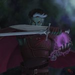
Glaurung
Forgot the cutesy in my other pants. Sorry.
- AKA
- Mama Dragon
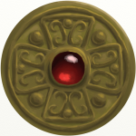
I'd personally probably make it a little brighter, but overall I think it's looking pretty good. I think the back might benefit from having some texture too it, though not as much as the last version you posted.
I tried adding a bit of leather texture, but it became as cluttered and muddy as the first version. Plus, since textures are high-res photos, when put against a design that is made to emulate paint it looks... too photoshoped. It would work all right had I rendered the crest on a 3D program to make it look more realistic, though. Kinda like the splash screen from Skyrim ultimate edition.
I love textured backgrounds, but I have to admit that with a book cover, minimalism works way better.
