I know What's Beneath the Snow Fields, a ridiculously long FF7 fic from 1999

Odysseus

Ninja Potato
AKA
Ody
So the author mistakenly refers to mako as "materia" a good few times during a flashback sequence of Vincent as a Turk doing a mission in a mako reactor. Using word search I found that she doesn't use the term mako at all for another two hundred pages from that point, so I'm guessing someone corrected her eventually. I'm not gonna fix that, but I'm thinking I should leave a footnote about it.
 
I'm waffling a bit between 1 and 2, but think I'd say 1. I like that 2 puts the focus on the atmosphere for the front cover, but I do think the figure helps the composition - the white tree is maybe a tad overpowering without it, and with the figure there's a nice sort of foreground, middle ground, background thing going on with the elements. I do think the whole piece/spread works without the white figure, but, as a cover, I'm leaning towards 1.

Although I like the idea of having the characters on the front cover, I think the composition for the front cover in 3 feels a bit too cramped/centered.
 

Odysseus

Ninja Potato
AKA
Ody
Agreed, tree was a bit too strong by itself. Overall I prefer 2 but I think that's just because it works better as an overall image that way, but it's important to keep in mind you won't be able to see Vincent and Aeris normally when holding the book. I still felt like the figure stuck out a bit too much, so I tried to blend him a bit better. I think I'm happy with it now:

Final cover.png

It's also just hitting me now that the composition of characters with their backs turned to the viewer looking at the Shinra building is very reminiscent of the original game's American box art. Cool.

Also if anyone is curious, here's the actual drawing that I used to make the silhouette, drawn by my co-collaborator:
Snowfields_Davoren_sm.png
He's basically Rufus meets Sephiroth, I swear.
 

Odysseus

Ninja Potato
AKA
Ody
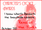
Awe shit, this was an AWARD WINNING fan fic
Untitled-2.png
Reno himself approves, you gotta read it.

Angela found the original site the story was hosted on and shared it with me, which lead to the discovery of some excellent goodies like that. I'm currently revamping the book to have a bit more of a 90's internet edge to lead into the fic, and that award is totally going on the back cover lol. There was actually a second award on their awards page but the image wasn't archived. If anybody wants to get in on this shit and let me be lazy, feel free to design your own " Most Addicting FF7 Fanfic Award " from Aeris Gainsborough herself. Otherwise I'll do it myself eventually lol, but the more I can be lazy outside help the better imo.
 

Odysseus

Ninja Potato
AKA
Ody
That biography and interview with writer Zahra is quite the trip.

Also, I finally have a cool signature. (too bad I'll never see it on mobile)
I'm glad you made it actually hyperlink to the site lol.

Yeah, that bio and the interview will be included as an extra in the book, it's interesting stuff. Her life was kinda nuts. Too bad I can't get in contact with her now, I'd love to do a "20 years later" follow up interview.
 

Prism

Pro Adventurer
AKA
pikpixelart
Agreed, tree was a bit too strong by itself. Overall I prefer 2 but I think that's just because it works better as an overall image that way, but it's important to keep in mind you won't be able to see Vincent and Aeris normally when holding the book. I still felt like the figure stuck out a bit too much, so I tried to blend him a bit better. I think I'm happy with it now:


It's also just hitting me now that the composition of characters with their backs turned to the viewer looking at the Shinra building is very reminiscent of the original game's American box art. Cool.

Also if anyone is curious, here's the actual drawing that I used to make the silhouette, drawn by my co-collaborator:
He's basically Rufus meets Sephiroth, I swear.
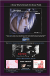
This new version is the best, IMO. Has the best of 1 and 2
 

Odysseus

Ninja Potato
AKA
Ody
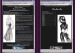
Digging up the original site made me totally change my approach to how the beginning of the book looked. Originally it was very Typical novel-style, but I realized I wouldn't be doing this project justice unless I well whole-ham into the web 1.0 look:

page 1.PNG
DO IT. CLICK THE BOOK.

Title page, based on the homepage of the site. Oh look, I made my own damn Aeris award by the way
Aris award.png

Eye-bleeding. Perfect.

The next image is a two-page spread
inner Cover.jpg

A E S T H E T I C. That's the real title page lol. It's goddamn Y2K and you're gonna feel it.

page 4 and 5.PNG
Contents page still a WIP. I couldn't find the actual window header font for windows '98, and it is killing me inside.

All the unique assets on the site were just too good, like those buttons on the bottom of the pages, I couldn't let them go to waste. Part of me was tempted to do the whole book as if you were browsing on Windows '98 internet explorer, but I think that would be a bad idea lol. After the initial pages it looks like a normal book again.

Part of me is worried that the Y2K internet aesthetic clashes a bit with the cover design, but then I remembered that the cover itself is based on a website's front page lol. It all comes together. I put too much thought into this shit.

By the way, I've only put in four chapters and it's already 94 pages long. There's definitely going to be a second book.
 
Last edited:

Odysseus

Ninja Potato
AKA
Ody
You made that Aerith award? It's so good I thought it was genuine.
Don't give me too much credit, I just appropriated the design of the website the award came from in the first place.
https://web.archive.org/web/20041208144532/http://aeris.deep-ice.com/exits.html
I kept trying to get on an older version to see if the award was still visible on her end (nope) but I was having some trouble getting onto the 2000 version of the page. I found my way to the newer version and saw that eyesore of a background and realized it was perfect for what I wanted lol.
 

Odysseus

Ninja Potato
AKA
Ody
^I love that

Okay, I've finalized the look of the pages.
1.PNG
2.PNG

The copyright page and content page are the same as in my last post, just with the snow background added.
I figured it was important to keep the snowy feeling of the cover page, since as it was the whole Windows 98 thing I was going for kind of contrasted it too much for my liking. I found a preset background that came with Windows 2000 that felt appropriate for the job.

One question I have for the viewing audience though. After you click the book to enter, the remaining pages look like a normal book
ex3.PNG

Part of me thinks that's bad because it doesn't mesh with the windows aesthetic of the beginning, but most of me thinks that's for the best because it's clean and easy to read. What do you think?

Also, @cold_spirit , right now I'm thinking of putting the Author's bio and the interview in the back of the book. I didn't forget about them lol.
 

Odysseus

Ninja Potato
AKA
Ody
I don't need your likes, I need your opinions lol.

After editing the text of the story more, I decided it's for the best that the main story portion of the book looks normal. The book is startig to serve the dual purpose of preserving the story and preserving the website itself, so I think it's better to let the story stand on its own two feet seperate from the website. Once you get into reading, the other stuff slips away anyhow. I want to lull people into a false sense of security for something I have planned anyway lol.

So, one last chance at AUDIENCE PARTICIPATION here. There's a to page on the website where you can adopt a scene from the story. Of course I'm putting that as an extra in the book too for the pre-existing entries, but I'd also welcome new ones if anywan actually wants to read this story and pick one out lol. I know I'm gonna do it, anyway.
 
Top Bottom