Okay, here are a few things that caught my eye.
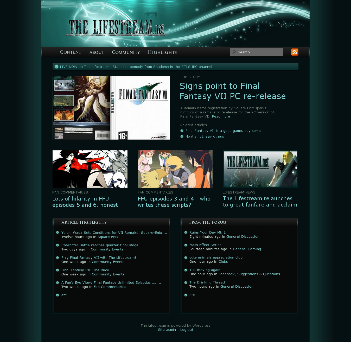
1. The search bar and RSS icon are not vertically aligned in the menu bar; they're a little too high. Should be an easy fix.
2. All the article images on the front page feel too big. From the conversation above it seems like getting them right is an ongoing project, which is good. I guess it's a matter of taste, but I think they would look better shrunk down a little, as they were in the
draft.
3. The text-to-white space (or black space) ratio in the "more news" and "latest from the forums" sections is a bit too high. I think that either the font size should go down a notch or the line spacing should be increased. Or both.
4. The materia orbs currently in use seem like they aren't glowing, as they're pretty pale. As Kuroto pointed out to me yesterday when we were looking at it together, it makes them seem inactive. I notice they have a thin dark outline as well, which makes them stand out in the "happening now" bar in an unpleasant way. I think I already shared the blue one I used in the draft, but
here it is again.
5. On the subject of the "happening now" box, is that going to be there all the time, or only when there is something actually going on? If it's the latter, I think it would be nice if it appeared at the top of all pages, including articles themselves. Also, how would one go about updating what it says?
6. The headings of "more news" and "latest from the forums" are quite badly rendered in my browser (Chrome, 1366x768).
Here's a screenshot to show you what I mean. How does it look for everyone else?
7. There seems to be a 1px black border running down the left of the page that isn't there on the right. Why is that? Also, the main banner is still off-centre on the forum.
8. I still need to design an arrow for the menus, don't I? I said it was a five-minute job, but those are the ones that always get postponed... I'll get on it. Also, I'll pop into IRC in a bit
")

 .
. Gonna have to get used to navigating it, but I'm always like that to new sites anyways.
  (Which is another option btw, I could make it so that any thread with NSFW in it is ignored. But that would have to require some sort of middle stage storage as going through all forum thread titles when someone enters the front page is a tiiiiny bit overkill...)
 ;
; (I remember you posted a draft with measurements once, but I can't remember if that was based on the last version or not; also, thread has too many pages...)