New TLS Front Page

Cthulhu

Administrator
AKA
Yop
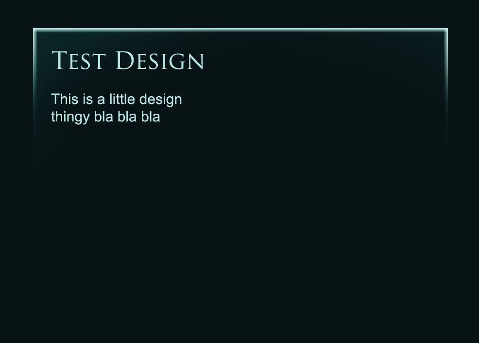
'Kay, an update. I fixxed up the frontpage preview things:

* (refactored) Both 'more news' and 'latest from the forums' entries now get output by the same function, which helps make them consistent.

* Added a date / time to each entry:
* If less than 24 hours ago, it will show 'X seconds', 'X minutes', or 'X hours ago'.
* If more than 24 hours ago, it'll show 'Yesterday' or 'X days ago' with the time of poast (in 12-hour AM/PM time)
* If more than a week ago, it will show the full date / time ('December 30, 2011, 10:12 AM)
* Hovering on the date/time will show the full date regardless of whether it shows relative date or not.

* Added category + link to each entry
* Materia icon bullet points <3

Let me know how it looks etc.
 

Cthulhu

Administrator
AKA
Yop
I added the menu items and fixed the submenu positioning, submenus aren't a problem.

Don't baw about them being the wrong links, we'll have to set up the page and links and whatnot again anyway when we install the theme on production, :monster:

What're we going to do with comments? Will we hide / disable the comment form and just put up a link to the forum thread?
 
*PUBLIC REVIEW HAS NOW STARTED: SUNDAY, OCTOBER 21ST*

We need to know what the members think about the new design. What do you think about appearance and implied content structure? For this we have two preview pages. The links are incomplete; the most you can review aside from these two pages (with the new design) are the news items. Click on those and tell us what you think!

Preview Pages:
- MAIN PAGE
- NEWS LIST

The members will have up until Friday October 26th to provide input. Further edits to the design can happen during this time. The day after, this Saturday, the redesign will be published. This will mean a site downtime ranging from 2-6 hours.

NOTE: The redesign has been made to look proper in Firefox and Chrome. There are no plans to adapt the new frontpage to appear as it should in Internet Explorer.
 
Last edited:

Cthulhu

Administrator
AKA
Yop
Actually, just review all the pages / things on the new site, just pick out stuff you like / dislike and remark.

As for IE, it might look sorta like it does atm in modern browsers (chrome/firefox, maybe opera) in IE 10, which will have some modern support for things we use on the new page (mostly borders and shit).
 

Fangu

Great Old One
Well my focus was to have the site look good on all the things, even iPads, cell phones etc. If someone added something in the last minute that doesn't work in IE, then that's on them, and do hang your head in shame :monster:
 

Cthulhu

Administrator
AKA
Yop
I blame Flint's idea on side image things, no u :monster:.

(I don't think ipads etc should be a major problem, their browsers are usually pretty up to date; Chrome uses the Webkit rendering engine, as do most mobile devices, so. But feel free to test, :monster: )
 

Fangu

Great Old One
Yop, when you re-factored my functions, something went wrong. "Happy 15th Anniversary, Final Fantasy VII" now shows up in both "Related articles" for the top post, and in "More News". Same with "Cait Sith" and " Dropping the plate". You have to exclude the first 3 articles from the category of the top post.
 

AvecAloes

Donator
Well my focus was to have the site look good on all the things, even iPads, cell phones etc. If someone added something in the last minute that doesn't work in IE, then that's on them, and do hang your head in shame :monster:

I'm looking at the links that Shademp posted on my phone right now (iPhone 4) and the view is wonky. Everything is shifted to the left. I think it looks great on a computer, though.
 

The Twilight Mexican

Ex-SeeD-ingly good
AKA
TresDias
My Droid Razr shows the same aligned-left look that AA got, but it's still readable/navigable, and the images in articles seem to do what they're supposed to.

Pretty awesome look to the whole thing, by the way. I'm impressed.
 

Cthulhu

Administrator
AKA
Yop
The weird behavior on mobile devices is actually part of the responsive design from the base theme we based it on; it seems the main menu just doesn't scale along too well. I'll fiddle around with it.
 

Fangu

Great Old One
I'm looking at the links that Shademp posted on my phone right now (iPhone 4) and the view is wonky. Everything is shifted to the left. I think it looks great on a computer, though.
The weird behavior on mobile devices is actually part of the responsive design from the base theme we based it on; it seems the main menu just doesn't scale along too well. I'll fiddle around with it.
Before the menu was changed, the items in the menu weren't fixed, as they are now. They stacked in two rows, showing two items per row. I guess the changes to the Search box and the RSS icon is what did it. I checked it on my Android now, and it does look a lot different (= worse) than it did when I tested it before the menu was changed. As it is now, the dynamic thingy doesn't work at all, as in what Avec says. The pictures and text is supposed to line up neatly, but now there's a grand space to the right of the content. It would be awesome if you could fix it. The original WP menu bar for Twenty Eleven is a good reference btw. Also I guess you already saw the CSS has rules specified for mobile and pads. It's down on the bottom in the CSS.

(You didn't edit the CSS in the Twenty Eleven folder, did you? If you did Imma kill you :monster: No I wont. But I will whip you a little.)
 

The Twilight Mexican

Ex-SeeD-ingly good
AKA
TresDias
I wouldn't worry too much if you can't easily get it to scale, Yop. I never expect everything to look perfect on mobile, no matter how hi-tech the device.

It really is fine the way it is. Though, given all the efforts from you guys, I can understand why you would want it to be perfect.
 

Cthulhu

Administrator
AKA
Yop
/me quickly goes to edit stuff in the twentytwelve theme, :monster:.

Doing some stuff now:

* Updated to latest WP version; it has a theme preview thingy so you can do stuff. Doesn't seem to allow you to set up widgets and the like before going live though. Oh well.
* Removed the contact form for now, the existing form was broken anyway. Replaced with link to the forums.
* Updated other stuff.

Gonna fuck around and see if we can base the new theme on the latest official Wordpress theme now. Stuff will probably break, but eh, it's worth to try.

Edit: Tried, shit breaks, but not massively. Some project perhaps for after transferring over.
 

Fangu

Great Old One
The "happening nao" message for the first couple of weeks could be something like "TLS has undergone some changes, if you experience bugs please report them here" etc.
 

Cthulhu

Administrator
AKA
Yop
Yeah, I was just thinking the same thing last night, :monster:. With a link to a feedback thread, off course. And off course a news announcement highlighting the changes and whatnots.
 

Pixel

The Pixie King
Here are the missing entries for the Audiobook page

Case of Barret
COBCoversmall.jpg

After leaving Marlene with Cloud and Tifa in Edge, Barret, played by psylentknight, sets off on a journey to settle the sins of his past, meeting a few familiar faces along the way.

Case of Yuffie
COYCoverthumb.jpg

After the Meteor's destruction, Yuffie, played by Mizura, returns to Wutai to find that a mysterious disease has taken hold of the inhabitants. She sets off to find materia that can cure it.

Final Fantasy XIII -Episode i-
FFXIIICover1.jpg

Set directly after the events of the original game. Vanille and Fang continue to watch over Lightning, Sazh, Snow, and Hope as they reunite with Serah and Dajh.
 

Cthulhu

Administrator
AKA
Yop
I'm gonna do the switcheroo today / in a bit. I'm not expecting any major problems, maybe some small leftover bugs and stuff, but we can fixx those afterwards.
 

Pixel

The Pixie King
Was just messing around in photoshop. I dont know if this is possible, but imagine something like this border thingy(...but actually good looking) around the top of each article

borderthingycopy.png
 
@Pixel

That design is worth a try. Looks neat.


Questions to Fangu:

#1: Right now the top article has no images, only an embedded YouTube link. Is it possible to have a YouTube link *be* the top article image?

If we can't have it that way, but don't want to add an image into the actual article, is there still a way for us to paste a big "FFVII in Five Minutes" image into the list of four top articles on the main page?

In that case it would be this image.
sqRYB.png


#2: How does the site generate images for those 4 top articles? At the time of writing, an image is only displayed for the fourth article, "TLS Presents: Final Fantasy XIII -Episode i-", but nothing for "Kingdom Hearts 1.5 HD ReMIX Announced" or "A Fan&#8217;s Eye View: Let&#8217;s Play Dirge of Cerberus Chapter 2".

See what I mean
 
Last edited:

Cthulhu

Administrator
AKA
Yop
btw content people, make sure to instruct everyone that maeks poasts about how to add images for the posts; all new need to have images, etc.
 

Flintlock

Pro Adventurer
I'm happy to start working on recategorising this weekend, but there are some things I'd still like clarified. I'll post in the relevant thread.
 
Top Bottom