
You are using an out of date browser. It may not display this or other websites correctly.
You should upgrade or use an alternative browser.
You should upgrade or use an alternative browser.
Our Site
- Thread starter Lex
- Start date
Cthulhu
Administrator
- AKA
- Yop
Fangu
Great Old One
My first thought as well, when I saw your post last night. I haven't read it in detail, will do so later.Don't worry, it looks technically possible and whatnot,
Lex
Administrator
I love the look of that redesign Flint. I think the content of "Recent Article Highlights" should be "Latest from the Forum" though, since the rest of the page is dedicated to "other" articles. Just a suggestion
I can see the logic behind it pointing to some of our articles but with the goal of more actively engaging front-pagers with the forum I feel like we're taking a lot of space away from the forum than we had before, even with the "post of the week" highlight there.
I can see the logic behind it pointing to some of our articles but with the goal of more actively engaging front-pagers with the forum I feel like we're taking a lot of space away from the forum than we had before, even with the "post of the week" highlight there.
Fangu
Great Old One
The C of "Content" in the menu bar is now aligned with the T of "THE" in the logo. There are dozens of similarly minor alignment changes in this draft, and I won't bother pointing them out after this one. I've just tried to make all the spacing consistent.
The search bar and RSS icon have been vertically centred within the navigation bar, and have been joined by icons for Facebook and Twitter (no disrespect to our Tumblr and G+ accounts or the people who maintain them, but they aren't really on the same level as Facebook and Twitter yet). These icons should simply link to our pages/profiles on the social networks, while individual articles should have "share" buttons on them, as discussed.
The Materia orb in the "happening now" bar, and elsewhere, has been replaced with a nicer, more glowing one. I have requested that change at least a couple of times beforeI've used the orb more sparingly in this new design, as I think that it loses its effect if it is overused.
I'm glad you focus on these things. I would never ever bother to measure pixels with a ruler, but it's those little things that end up making a huge difference in the overall esthetics.
There are two things I can start working on right away. These are things I've been planning on a) making better and b) finishing up, because now it's kinda half arsed.
Those are:
a)
I wanted to use WP's built in "Posts Format" for this. If you open any post in WP, you can see this on the right side, under "Featured Image":Speaking of the "happening now" bar, I think we should keep it, but completely disable it when there is nothing going on. We have a habit of putting something there that either a) goes out of date very quickly, or b) is a somewhat mundane link to our forum, which is somewhat redundant, so I think we might as well hide it when nothing is happening.
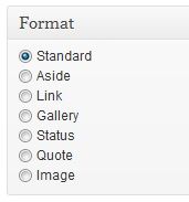
These are WP's built in "different kind of posts" categories. They were meant for blogs, like if you only wanted to post an image, or a link, you could choose to make your posts one of these, and only selected values from that post would be output on the blog page. (I haven't studied these in detail (yet)).
My thought was to 'reserve' one of those (or even make a new category) for the Happening Now. Meaning every announcement in the Happening Now could be made as a post, given a specific publish-time, and also we would have an archive.
I just have to proof-read and fiddle with it so Happening Now-announcements don't end up being published as actual articles. There should just be a variable you send into some function, but strange things have happened (like when the Header for the site was set as one of the Featured Images). So it has to be tested etc.
b)
Initially, the Featured Image was to be set by these priorities:The images have switched from a 2:1 size ratio to a 16:9 size ratio. I've become increasingly frustrated with the former, as it has forced me to crop parts of screenshots, Youtube videos (see the current featured image for an example of that), and so on. 16:9 is a common standard, and not radically different from 2:1, so let's go with it. We'd need to do a one-off conversion of some old images - four at most - to the new format, but after that, it would be so much nicer. I've made the large image 400px by 225px and the others 320px by 180px. I think we should hard-code those sizes in, so that even if someone sets a featured image which is the wrong size, it won't break the layout.
1) The Featured Image set by the author
2) A cropped version of the last picture uploaded to the post (all pictures are uploaded in a 2:1 version)
3) A default picture
tbh I don't know what it does right now. I thought 2) was working fine, but then someone told me they couldn't see any Featured Image on the front page when they published. That might have been due to no pictures being Uploaded to the post, which it very well might be - I think it was Force's article about the Podcast, and this one has no images in it, meaning we had no 1) or 2), and 3) isn't properly set yet because a) I needed someone to hand me over an image they wanted set as the default, and b) by the time we launched, we hadn't _properly_ decided on 2:1 yet.
So I'm all for 16:9. I can already start working on resetting the logic for the Featured Image to 16:9.
The reason the sizes aren't hard coded in as of now, is because I didn't want to limit strictly what people could or could not do when we first launched the site. I'm all for it though. I did start to write a logic that compares the width and length for a picture to check if it is in scale (allowing a certain flexibility of course since pixels are integers) but it was one of those things that weren't finished.
Another thing is,
The mobile layout isn't really vertical. The responsive design is divided into three categories:The second, third and fourth images have grown a bit from their current size, which was made possible by switching them from a horizontal to a vertical layout. I think that is more consistent with the way people read websites nowadays, particularly on mobile devices (though I'm aware we already have a vertical mobile layout). I've seen many news websites use that layout, too.
1) > 1000 px wide screen (computers)
2) > 650 && < 1000 (pads and smaller computer screens)
3) < 650 (phones)
...but as most cell phones will have a cat 3) screen anyway, it will place the elements in the exact same way vertically and horizontally.
Which brings me to: The very specific design things you mention in this post is for category 1) only. Have you made drafts for how things are going to behave on cat 2) and 3) as well? This affects how we end up structuring the CSS and the markup output, so it's very important it's taken into consideration from early on.
I'm assuming cat 1) only for the rest of my comments.
This is the easiest way to handle this. The option is to count the letters and put in an ... when the title is too long. But that doesn't look very pretty.The headlines for each article must not take up more than two lines on the new design. Ever. (...) I put together the new draft with that in mind: a headline that takes up the full two lines when it is the top story should also take up the full two lines, and no more, when it gets pushed down the list. The only thing that could go wrong is if a headline has a couple of unusually long words that force new lines, but we can just watch out for that. If it's not possible to hard-code the two-line limit, then we should instruct all our authors to edit their title if it takes up more than two lines, or we'll edit it for them.
Most likely because of what you're saying next:Each article is now accompanied by a proper description, not just the first article, and not just the first sentence chopped off half-way and appended with an ellipse. I pushed for this change last year, but it didn't happen, and I can't remember why.
If you're not gonna use the <!-- more --> or what it's called, then it would mean adding a new element to every post/page, which would also mean creating a new column in the database, adding several filters (which is liable to bugs) in the functions file(s), etc... there are probably plugins for this, but the risk, as I see it, is too high.Anyway, it is a vital part of making our site look more professional, which has been my goal with this draft. We should find a way to allow the descriptions to be set manually, because they might not always be suitable as the introduction to an article.
What could be done, is to put in some sort of marker in the post itself (like <!-- more -->, only with an end tag as well) and tell WP to look for it. (It will be auto-hidden in the post body itself.) If it finds it, output it on the FP. If it doesn't, do this or that. I'm sure that would be doable. I haven't googled for examples but I imagine it's one of those hax'es that has been done by others before.
Should be fairly easy. The CSS text-align:justify; should work.The descriptions are also fully justified, rather than left-aligned, which looks smarter and is standard on news sites.
Thought exercise: What if the top 3 stories are in the same category...? Do the "related" in the first article point to the 2nd story, or to the 4th story, or... you get my point. It's stuff like that that became a challenge in the last round, and it would be really good to do a "all possible outcomes" exercise here.Instead of the lead story linking to three others in the same category, now every story links to one. This gives us a greater variety of stories on the front page, and somewhat alleviates the problem of having related articles that were published years ago, if the top story is in a seldom-used category.
See comment above about the descriptions.For the second, third and fourth stories, there isn't enough space to put a whole article title in the "related" bit, so I've edited them, which I still think looks better than having an ellipse. Perhaps there's a way to manually set a long title and a short title for articles - we can look into that.
This is nice. Also, linking to threads in the forum in an article itself is nice. The debate about whether to turn off the comments on WP or not is a veeery long debate I won't get into. What I will say is that vB is a bitch, and even though we could be able to output stuff from a thread beneath an article, it's gonna be a bitch. (See comment further below)To encourage people to our forum, the top story now also contains a discussion link. I know this might seem unnecessarily strict, but I think every single article we publish on the front page should link to a related forum thread. The front page and the forum still feel too separate at the moment (more on that later).
Well done on the tagging work. Fangu likes this.Also making its début on the right-side column is "recent article highlights". I'm still in the process of recategorising and tagging all our old posts (I got a lot of it done this week), and the more I did it, the more I felt that our best articles are also our most original articles, in which the author shares some insight on the game that most players don't have, or presents a thorough analysis of some topic that most players would never have time to do. That's why I created a category called "Insights and Analysis". It is the posts in that category that are shown as highlights on the front page of my new draft. Of course, there's nothing to stop us from defining a highlights category (or tag) separately, in case we wish to include other types of posts, like translations (although we haven't published any of those in a while). Once a highlighted article has slipped off the list on the front page, we can assess whether it's been popular enough to add to the highlights part of the top menu, which should be reserved for our most historically popular articles.
(snip, content discussion)
Nah, it's also because of the incredible PAIN vB is. I spent HOURS trying to figure out how to pull out the current avatar of a member. I couldn't do it. (We will meet again, though, avatars. We will meet again.)I think people are much more likely to click through if they see a snippet of an actual discussion, rather than just a thread title. Besides, the way we currently present forum activity on the front page is problematic: we have to hide various sub-forums' threads from being shown already, but even so, we get threads with swear words appearing on the front page. I don't have anything against swear words, I should stress, but it doesn't look good. Other thread titles appear truncated, which is just weird: "The Love Triangle Debate thread of KNEEL BEFORE...", for example. Fangu did a great job with the forum feed last year, but it is my design which is the problem; I hold my hand up for that.
Also, posts aren't necessarily "Here the text beginneth, blah blah...", they can be a picture, or a smiley, or just three words. While just outputting three words is fine, the challenge comes when we have to interpret vB output on the front page, like :monster:, [QUOTE], [SPOILER] etc. We really need to lean on what vB already knows, and this is where the pain begins. New smileys are added all the time, so we have to tap into vB's brain somehow, and the thought just sickens me. It's almost as if I feel like it's better to look for actual text (jump over all ['s and :'s) but this is so open for bugs I wouldn't trust it. A thread title is always text, a user name is always text etc. that's what makes them easy to fetch. The post itself... not so much.
The important part is to display a variety of articles on the front page, be it with or without pictures and descriptions. I feel the front page as of now is way too naked - there's not much to choose from, and besides from the top story and the "medium top stories", there isn't really much to focus on. Sure it's all there in the menus, but you want to catch the users attention. Which I think this design does a lot better than the current one.Moving back to the left again, the "more news" box has gone, because I felt like it would have been very isolated on its own (...)
Where? I don't see it... wait. I'd never noticed that, haha.Finally - and this is a very minor change indeed - the right-hand border of the main div has gained the 1px dark green border that is present on the left, but has been missing on the right
I like it. It's a lot closer to how I visualized the new FP. Nice work!When making the draft, I started off with our current design and tried to make it three things: neater, more informative and more professional. Let me know whether you think I failed or succeeded with those goals, and feel free to give me any other feedback as well.
Edit: I never really made a mock up of what I imagined, to me it was always something like this. Not pulled out and in like it appears now, but the basic shapes of it.
Last edited:
Flintlock
Pro Adventurer
Excellent post, Fangu. This is why I like working with you - I can throw a bucketful of ideas at you, and even when I worry about it being too much, you come back and say exactly what can be done easily, what can be done with difficulty, and what probably needs to change. In detail:
")
So, let's say that the all four top stories are all from the same category. I think that each article title should only appear on the left-side column (which includes the main article) once. So the related article on the top story would be the fifth post in that category, the related article on the second story would be the sixth post in that category, and so on. That's not a perfect solution either, as sometimes we might pair up some "related" articles that aren't really related at all. This is, again, the kind of thing that I think might be best to set manually for each post, but I understand the problems of implementing that. Let's think about it some more.
If we do keep the list of recently updated articles, then perhaps we should do two things: firstly, only show posts from our FF sub-forums, and secondly, ask the forum moderators to be more active in editing thread titles so they accurately reflect their content, and without using swear words or anything like that. So "The Love Triangle Debate thread of KNEEL BEFORE..." could just be "The Love Triangle Debate thread", for example.
For everything I haven't quoted: good
My draft was for cat 1 only. I admit to never having designed anything for pads or phones before. I didn't do a draft for them last year, but I can do so this time around. Just bear in mind that I won't be as good at it as I am with cat 1, so it'll probably need more, er, ironing...but I'll just refer to the point I'm making further down. Do think about how these things should look in the two other categories (explained later). It's not critical for the process, just keep it in mind.
...
Another thing is,
The mobile layout isn't really vertical. The responsive design is divided into three categories:
1) > 1000 px wide screen (computers)
2) > 650 && < 1000 (pads and smaller computer screens)
3) < 650 (phones)
...but as most cell phones will have a cat 3) screen anyway, it will place the elements in the exact same way vertically and horizontally.
Which brings me to: The very specific design things you mention in this post is for category 1) only. Have you made drafts for how things are going to behave on cat 2) and 3) as well? This affects how we end up structuring the CSS and the markup output, so it's very important it's taken into consideration from early on.
The solution you propose in the second paragraph sounds fine. If it's not possible, then we should just take everything before the <!-- more --> tag and encourage our authors to keep their introductions short, editing them after publication if needs be.If you're not gonna use the <!-- more --> or what it's called, then it would mean adding a new element to every post/page, which would also mean creating a new column in the database, adding several filters (which is liable to bugs) in the functions file(s), etc... there are probably plugins for this, but the risk, as I see it, is too high.
What could be done, is to put in some sort of marker in the post itself (like <!-- more -->, only with an end tag as well) and tell WP to look for it. (It will be auto-hidden in the post body itself.) If it finds it, output it on the FP. If it doesn't, do this or that. I'm sure that would be doable. I haven't googled for examples but I imagine it's one of those hax'es that has been done by others before.
Somehow, that managed to evade my thought process completely last night. One option would be to make each category have a maximum of one post on the front page, but I don't like that option. There may be a breaking news story - a FFVII remake, for example - that is so big and important for us that we fire off four articles about it in a week. We shouldn't be hiding any of them for the sake of some unrelated articles in that situation. Weekly Roundups is the only category that should only be allowed one article on the front page, if you're able to code that in somehow (mind you, if we are going to do that, we need to get more non-roundup articles published on a regular basis).Thought exercise: What if the top 3 stories are in the same category...? Do the "related" in the first article point to the 2nd story, or to the 4th story, or... you get my point. It's stuff like that that became a challenge in the last round, and it would be really good to do a "all possible outcomes" exercise here.
So, let's say that the all four top stories are all from the same category. I think that each article title should only appear on the left-side column (which includes the main article) once. So the related article on the top story would be the fifth post in that category, the related article on the second story would be the sixth post in that category, and so on. That's not a perfect solution either, as sometimes we might pair up some "related" articles that aren't really related at all. This is, again, the kind of thing that I think might be best to set manually for each post, but I understand the problems of implementing that. Let's think about it some more.
Thanks. Once everything has been recategorised and retagged, it should make some tasks easier for us. If we want to put together a list of all our FFVII translations, for example, we just search for all articles in the translations category that are tagged with FFVII. That would have been a long manual process before.Well done on the tagging work. Fangu likes this.
Just for clarity, if we were to go with the forum post of the week idea instead of a list of recently updated articles (and I understand Lex's concerns with that idea), we would write that quote manually, selecting the best line from the best article, so we wouldn't need to worry about a post starting with a cookie monster or anything.Also, posts aren't necessarily "Here the text beginneth, blah blah...", they can be a picture, or a smiley, or just three words. While just outputting three words is fine, the challenge comes when we have to interpret vB output on the front page, like :monster:, [QUOTE], [SPOILER] etc. We really need to lean on what vB already knows, and this is where the pain begins. New smileys are added all the time, so we have to tap into vB's brain somehow, and the thought just sickens me. It's almost as if I feel like it's better to look for actual text (jump over all ['s and :'s) but this is so open for bugs I wouldn't trust it. A thread title is always text, a user name is always text etc. that's what makes them easy to fetch. The post itself... not so much.
If we do keep the list of recently updated articles, then perhaps we should do two things: firstly, only show posts from our FF sub-forums, and secondly, ask the forum moderators to be more active in editing thread titles so they accurately reflect their content, and without using swear words or anything like that. So "The Love Triangle Debate thread of KNEEL BEFORE..." could just be "The Love Triangle Debate thread", for example.
That's not working for me at the moment. Try picpar?Edit: I never really made a mock up of what I imagined, to me it was always something like this. Not pulled out and in like it appears now, but the basic shapes of it.
For everything I haven't quoted: good
Fangu
Great Old One
Weird, Carlie says she can see it.That's not working for me at the moment. Try picpar?
Try this? http://i.imgur.com/XRUSMlW.jpg
D
Deleted member 546
Guest
Despite not being on staff or anything, I do look round the site every so often just to see what's going on, and the front page always looked a little lacking IMO (no criticisms, it just looked like it could be improved). Flint's new layout is super, it maximises the space available without it being overwhelming.
Just my two penn'orth, good job folks.
Just my two penn'orth, good job folks.
")
Dawnbreaker
~The Other Side of Fear~
Our site...in the middle of the internets...our site...
...what, I like the song.
Also, good work, folks.
...what, I like the song.
Also, good work, folks.
Flintlock
Pro Adventurer
You think we should have three articles horizontally underneath the top story before we have some vertically as well? I suppose that could work. I'd be inclined to have descriptions on the horizontal articles, but not for the vertical ones underneath, to avoid it becoming too cluttered. I would probably also remove the recent article highlights section and return to having the most recently updated forum posts there, if we are going to keep that section.
In fact, I can see that layout looking pretty good. I can knock up a proper draft of it sometime this week, so we can see it side-by-side with my first one and make a decision on which one to proceed with.
I can see what you were going for with the Happening Now bar, but I think we'd risk simply duplicating our top stories there most of the time, as we don't actually have that many "events" to broadcast. That's why I think we should switch it off when nothing is happening, so that it actually grabs a bit of attention when it is there (and when it is active, we could have it visible on all our posts, if we wanted to).
Fangu
Great Old One
^
The Happening Now-bar: Yeah, I guess a plain sentence/ link is better. Having a little image in there would be nice, but not a necessity at all. For the Happening Now bar to be turned on or off, I'll have to think up some clever way to flag "there's nothing here". Making a checkbox in the admin panel is the hard (but best way to learn) way. It's one of those things that'll be part of Summer Games
My draft was just a very quick cut and paste-job to show how I visioned "the rest of it" when I started. It doesn't have to be copied 100%. However my idea was to have the page parted in clean 2's or 3's, or maybe even 4's. Easy to turn into a responsive design (pads, phones etc) and an easy CSS to maintain.
I agree that having descriptions on the horizontal articles would be nice. The current horizontals always felt a little anonymous. The article highlights section is something I think ought to be there, if not 3 stories, then at least 1. It's a nice way to draw direct attention to the things we're good at and known for. But that's just my 2 cents.
I'm glad it brought some workshop inspiration though
Two Content related things I noticed:
1) Should the "Archive" link switch from "About" to "Content"? The reason I ask is because I was looking for the archive and didn't think to look for it in "About", I was dead sure it would be in "Content" somewhere. Just a thought.
2) The Content > News & Updates (http://thelifestream.net/news/) now breaks the posts at "more". It didn't do so previously, iirc. Is it fine as it is now, or should we output entire posts?
Shademp
420
My personal preference would be to move Archive to the bottom of the Content list. Archives should be (and is usually) the last thing one looks for.1) Should the "Archive" link switch from "About" to "Content"? The reason I ask is because I was looking for the archive and didn't think to look for it in "About", I was dead sure it would be in "Content" somewhere. Just a thought.
In my opinion it is better to break the posts. Makes it quicker to browse through the article history, being that some newsposts are more lengthy than other.2) The Content > News & Updates (http://thelifestream.net/news/) now breaks the posts at "more". It didn't do so previously, iirc. Is it fine as it is now, or should we output entire posts?
Jiro
Average Jiro
The problem I have with this mock up is that it's very long. Scrolling a lot isn't fun. The current layout only shows you the main featured story plus half the images for the trio below it (on my screen, an average laptop size) which is not bad but does mean the eye-catching images aren't actually catching much of my eye.
Having a forum boxout is always good for encouraging activity, but I do suggest you shoot for a clean frontpage as it looks way better and is more inviting.
I went back through the thread a bit and found Flintlock's mockup. I think it's better, more streamlined, but that community news banner takes up a lot of room and if it can be bumped up then you'll be able to see the second article/podcast thing.
God I am rambling now, I hope you get my point.
:2cents:
Flintlock
Pro Adventurer
^ I agree that current page design being quite long, with a low information density at the top, which was something I sought to address with my first draft. The community news banner (or the "happening now" bar, as we call it) takes up a fair amount of space, but if it can be disabled when it's not in use, then that won't be much of a problem. I experimented with a new location for it in my second draft, which is largely based on Fangu's mock-up.
Now that it's ready, I think I prefer the first draft, but working on this has given me some more ideas which I'd like to incorporate into a "compromise" layout. I like the forum box on this version, for example. Instead of returning the most recently active threads on the whole forum - which creates the problems I described earlier - now it fetches the one most recently active thread from each of our Final Fantasy sub-forums. They are the ones we want to be promoting to our visitors, after all, and unlike General Discussion, they're available to view without needing to be logged in.
Now that it's ready, I think I prefer the first draft, but working on this has given me some more ideas which I'd like to incorporate into a "compromise" layout. I like the forum box on this version, for example. Instead of returning the most recently active threads on the whole forum - which creates the problems I described earlier - now it fetches the one most recently active thread from each of our Final Fantasy sub-forums. They are the ones we want to be promoting to our visitors, after all, and unlike General Discussion, they're available to view without needing to be logged in.
Last edited:
Lex
Administrator
Since you're creating them, just make them British English. I don't want this to turn into a discussion about which one we should use because I'm sure I'm as horrified by the idea of having to use American English as Americans are about using the original (West Germanic/Anglo-Frisian/Norse, of course ).
).
Last edited:
Flintlock
Pro Adventurer
For what it's worth, I really don't care Living abroad makes you realise it doesn't actually matter. I just want to be consistent. If our site was hosted in the US, or owned by an American, then I think it would be a clear-cut case, but as we're notionally a Dutch website, I thought I'd ask.
Unrelated: I've found a way to set custom intros for articles on the front page. They're called excerpts, but they're hidden by default in the new post interface. If you click "screen options" in the top-right corner, then select "excerpt" and close the screen options, the box will appear. Neat. I'm not sure if we still need to fiddle with something on the front page. Perhaps not, if I understand this page correctly:
"In both cases, if you have set anything in the Excerpt meta box on the post editor screen, that text will be used. Otherwise, the excerpt will be automatically trimmed."
Living abroad makes you realise it doesn't actually matter. I just want to be consistent. If our site was hosted in the US, or owned by an American, then I think it would be a clear-cut case, but as we're notionally a Dutch website, I thought I'd ask.Unrelated: I've found a way to set custom intros for articles on the front page. They're called excerpts, but they're hidden by default in the new post interface. If you click "screen options" in the top-right corner, then select "excerpt" and close the screen options, the box will appear. Neat. I'm not sure if we still need to fiddle with something on the front page. Perhaps not, if I understand this page correctly:
"In both cases, if you have set anything in the Excerpt meta box on the post editor screen, that text will be used. Otherwise, the excerpt will be automatically trimmed."
Last edited:
The Twilight Mexican
Ex-SeeD-ingly good
- AKA
- TresDias
I pereonally don't care which we use. Obviously, I'm more accustomed to the American English variant, but it wouldn't kill me to put a "u" in "color" or to put closing quotation marks inside ending punctuation.
Fangu
Great Old One
Ahaa! Awesome. I've been fiddling with some excerpts code, I've actually been using them in the WP FP functions. I didn't know they were a separate thing - I've set them to take out x amount of characters from the article, iirc.Unrelated: I've found a way to set custom intros for articles on the front page. They're called excerpts, but they're hidden by default in the new post interface. If you click "screen options" in the top-right corner, then select "excerpt" and close the screen options, the box will appear. Neat. I'm not sure if we still need to fiddle with something on the front page. Perhaps not, if I understand this page correctly:
"In both cases, if you have set anything in the Excerpt meta box on the post editor screen, that text will be used. Otherwise, the excerpt will be automatically trimmed."
This is good.
Fangu
Great Old One
Shademp and I was on Skype and we realized there's a plugin we once installed when the old page was active. I disabled it as we don't need it - it was called "Exclude Pages from Navigation".
Also I uploaded new version of Featured Images for two of the articles, as the featured image wasn't set to 2:1.
When I did that I also found out that ctrl + drag doesn't keep the ratio you've put into the ratio box. That sucks. WP why did you do that?
Also I uploaded new version of Featured Images for two of the articles, as the featured image wasn't set to 2:1.
When I did that I also found out that ctrl + drag doesn't keep the ratio you've put into the ratio box. That sucks. WP why did you do that?
Shademp
420
I've asked myself that question A LOT recently. =/ WordPress y u so bitchyWP why did you do that?