Prism's Art and GameDev Thread

Prism

Pro Adventurer
AKA
pikpixelart
How's it going, everybody? This thread is where I'll just post whatever work I'm doing at the time. Here's some my recent stuff!

usgXX00.png


This piece is a study of a Porco Rosso still frame. I made a pixel art version of it.

RcP52o9.gif


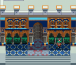
Here's a title screen for an action RPG I'm working on...

9HMSXzN.png

...And here are the two main characters!

2E7IE2g.png


I'm trying to put extra detail into the project's architecture.

Y7CQjIJ.png


As a bonus, here's what I'm envisioning the main character to look on a closer scale.

Mv20n6R.png


A low-poly 3D head, to be used later (but mainly for fun)


IV3wyAy.png

A tea kettle.

KvOYcP7.png

An original work - "Summer Mountain Memories"

rMgj4lo.png

A kid named Fynn exploring his dreamscape.

smGNXFL.png

A nighttime Earth lit by electricity.

tcRq5tf.png

A Final Fantasy pixel mural I have no idea how to finish


Thanks for checking these out!
 

LNK

Pro Adventurer
AKA
Nate
How's it going, everybody? This thread is where I'll just post whatever work I'm doing at the time. Here's some my recent stuff!

usgXX00.png


This piece is a study of a Porco Rosso still frame. I made a pixel art version of it.

RcP52o9.gif


Here's a title screen for an action RPG I'm working on...

9HMSXzN.png

...And here are the two main characters!

2E7IE2g.png


I'm trying to put extra detail into the project's architecture.

Y7CQjIJ.png


As a bonus, here's what I'm envisioning the main character to look on a closer scale.

Mv20n6R.png


A low-poly 3D head, to be used later (but mainly for fun)


IV3wyAy.png

A tea kettle.

KvOYcP7.png

An original work - "Summer Mountain Memories"

rMgj4lo.png

A kid named Fynn exploring his dreamscape.

smGNXFL.png

A nighttime Earth lit by electricity.

tcRq5tf.png

A Final Fantasy pixel mural I have no idea how to finish


Thanks for checking these out!
I'd say watercolor
 

Prism

Pro Adventurer
AKA
pikpixelart
Thanks a lot everybody! I'll move forward with that retro style, Odysseus. I much prefer it to modern anime.

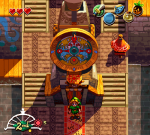
clocktower3.png
In a continuing trend of me making art of people standing in front of buildings, here's a Majora's Mask pixel demake. I had a lot of fun with the lighting on this one - it was originally a lot more drab.
 

Prism

Pro Adventurer
AKA
pikpixelart
There was actually a Chinese demake for the NES. A Prism demake would definitely be prettier, though. ;)
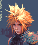
The fact an RPG as massive as FFVII was able to be put on MUCH older hardware while telling its full story is incredible, especially since it was in 2005. (the fan-patch from 2013 is also impressive for similar reasons, giving things a needed overhaul) Oh, and thank you. :monster: And thanks for linking it!

God damn you're so good! Makes me want to see an FF7 demake in the style of a retro rpg like ultima or something.
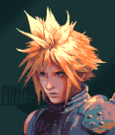
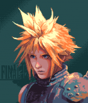
Making demake graphics is incredibly tempting. Obviously, I'm not crazy enough to redo the whole game (or even a decent chunk of it), but a little taste of it might be fun. For the portrait I made a few days ago, it was based on Remake Cloud, but I wonder...it would be better if I stuck to the OG designs for a more thorough demake, right? I'm actually curious what you guys would think regarding that.
 
Last edited:

Prism

Pro Adventurer
AKA
pikpixelart
1584940306620.png
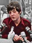
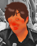
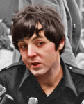
I'm taking on photo colorization, and it's been a pretty relaxing endeavor thus far. I think it'll become a hobby of mine. Here's a work in progress of one of Paul McCartney!

1584927989516.png
 

Attachments

  • 1584927746162.png
    1584927746162.png
    196.8 KB · Views: 4
Last edited:

Odysseus

Ninja Potato
AKA
Ody
Hey Prism, the way you're coloring that photo reminds me a lot of how I color my pencils. My base colors look equally nightmare inducing until the sketch is overlayed onto them. Are you overlaying the photo onto the colors, or the colors onto the photo?
 

Prism

Pro Adventurer
AKA
pikpixelart
Hey Prism, the way you're coloring that photo reminds me a lot of how I color my pencils. My base colors look equally nightmare inducing until the sketch is overlayed onto them. Are you overlaying the photo onto the colors, or the colors onto the photo?
Yo Odysseus! That’s a pretty good comparison, actually. I overlay the colors onto the photo instead of the other-way-around, but the nightmarish process is shared. I wonder if there’s a slight difference in the effect depending on which you overlay (the color vs the photo)
Your art’s pretty cool, by the way. I stop by your thread every now and then. I should get around to actually leaving post, I’ve been meaning to.
 

Prism

Pro Adventurer
AKA
pikpixelart
Prism, do you mind if I ask what programs you're using?
I don’t mind at all, ask anytime.
For pixel art, the bulk of the work is usually in MSPaint. I do color correction and contrast edits in GIMP, though. The McCartney photo coloration’s being done in GIMP. The low-poly 3D art I did in the original post was done in 3DS Max.

For pixel animations (I don’t think I’ve posted any here) I use Aseprite.
 

Odysseus

Ninja Potato
AKA
Ody
Yo Odysseus! That’s a pretty good comparison, actually. I overlay the colors onto the photo instead of the other-way-around, but the nightmarish process is shared. I wonder if there’s a slight difference in the effect depending on which you overlay (the color vs the photo)
Your art’s pretty cool, by the way. I stop by your thread every now and then. I should get around to actually leaving post, I’ve been meaning to.
Oh so they are similar! I do wonder what the difference might be between overlaying the color vs the image. I actually have to darken the sketch layer considerably before overlaying it in order to preserve the colors, otherwise everything ends up getting too bright. I notice the colors you're using are darker thst they appear after you overlay them, so in principle we're probably doing the same thing.
 
Last edited:

Odysseus

Ninja Potato
AKA
Ody
Is that animated water an effect filter, or did you hand draw all the frames? Either way, it looks great.
 
Top Bottom