The Doodling Dragon

Glaurung

Forgot the cutesy in my other pants. Sorry.
AKA
Mama Dragon
EDIT OCTOBER 2021:

I've opened art commissions!!!

Won't bore you with all the details, so I'll refer you to my Carrd:

http://spanishdragon.carrd.co


But I will include my price sheet, you can have a peek at what I offer:


Price sheet fanart and portrait EU and USD.jpg


Hello, as some of you might remember, I like painting and doodling around. I thought I might share what I've been up to.

I had my brief stint as an art student at extramural classes, I left after my teacher suddenly fell ill and passed away. It just didn't feel the same anymore. I've been forever grateful to that man after he forced me to face my fear of color. Trully, I had always been drawing in graphite because it was my comfort zone and didn't want to get out. He just took my hand and yanked me out of it, throwing me into the mixing colors world as if it was a swimming pool. He also introduced me to alternative painting software that I could use in a tablet, like ArtRage, which I became addicted to. Here are the results over these two years:

whimsical_tree_by_glaurung_ii_dbj1zv8-fullview.jpg

My ongoing project of the FFXIII Major Arcana. Nine cards so far


And I got bitten by the Critical Role bug, so I've been in a roll lately (badum-tish)

There's also been silly doodles

Final Fantasy is also present in my gallery! Here's an illustration of a fanfict I wrote some weeks ago. Those who watched the movie and played the game know who this guy is.

And other projects I have on the backburner!
 
Last edited:

LNK

Pro Adventurer
AKA
Nate
Hello, as some of you might remember, I like painting and doodling around. I thought I might share what I've been up to.

I had my brief stint as an art student at extramural classes, I left after my teacher suddenly fell ill and passed away. It just didn't feel the same anymore. I've been forever grateful to that man after he forced me to face my fear of color. Trully, I had always been drawing in graphite because it was my comfort zone and didn't want to get out. He just took my hand and yanked me out of it, throwing me into the mixing colors world as if it was a swimming pool. He also introduce me to alternative painting software that I could use in a tablet, like ArtRage, which I became addicted to. Here are the results over these two years:

whimsical_tree_by_glaurung_ii_dbj1zv8-fullview.jpg

My ongoing project of the FFXIII Major Arcana. Nine cards so far


And I got bitten by the Critical Role bug, so I've been in a roll lately (badum-tish)

There's also been silly doodles

Final Fantasy is also present in my gallery! Here's an illustration of a fanfict I wrote some weeks ago. Those who watched the movie and played the game know who this guy is.

And other projects I have on the backburner!
I like the Caius one the most. He's one of my favorite characters, so I may be a little biased on that haha
 

Glaurung

Forgot the cutesy in my other pants. Sorry.
AKA
Mama Dragon
I like the Caius one the most. He's one of my favorite characters, so I may be a little biased on that haha

I have a love/hate relationship with him. On one side I feel for him, on the other, I just wanted him to get off my back. I swear I groaned in frustration when he made his entrance in Lighting Returns TT^TT
 
  • Like
Reactions: LNK

LNK

Pro Adventurer
AKA
Nate
I have a love/hate relationship with him. On one side I feel for him, on the other, I just wanted him to get off my back. I swear I groaned in frustration when he made his entrance in Lighting Returns TT^TT
Haha yeah, I hear you on that. I didn't like Lightning Returns when I first bought it. Definitely went back and finished it when I heard he was in the game. His voice actor killed it too!
 

Glaurung

Forgot the cutesy in my other pants. Sorry.
AKA
Mama Dragon
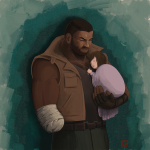
Ok, FFVII fanart was long overdue:

Barret and Marlene.png


Do you wanna hear a funny story? some months ago I twitted a sily thing about being excited for the Remake. John Eric Bentley answered my tweet out of the blue, and I talked about doing some fanart. So, this image popped up in my head and, when I was finished with the pieces I was working on, I painted it. Just for shits and giggles, I tagged him. What do you know, he gave me a like and a follow O_O Still can't believe it. Guy is really enthusiastic about FFVII.
 

Glaurung

Forgot the cutesy in my other pants. Sorry.
AKA
Mama Dragon
Oh Glaurung, that's lovely, I love that. Marlene is so small and his wound is still new. Call me corny, but I love thinking about how tiny little baby Marlene gave great big damaged Barret the strength he needed to carry on.

Nah, you are not corny. Little kids tend to have that effect when you have to take care of them. And thank you! :properhug:
 

Glaurung

Forgot the cutesy in my other pants. Sorry.
AKA
Mama Dragon
My Tarot project is not dead!

11-Strength.png

Ok, it's the turn for Fang. I had some difficulties at finding a fitting pose because I wanted her to look like the original card. Then I said "f#ck it" and searched for a pose which fitter her instead.

Miiiiiiiiight have gone a bit overboard with the arms and shoulders, but when you flex them, muscles are bound to bulge. Ok, it's a bit of self-indulgence. I will always find moderately muscled individuals more visual appealing... just bear with me, ok? :awesome:
 

Glaurung

Forgot the cutesy in my other pants. Sorry.
AKA
Mama Dragon
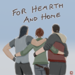
I was supposed to be caught up in the Remake maelstorm, but these guys won't leave me alone. Not that I complain. I can't get enough Kingsglaive.

Tried to get that watercolor/dreamy effect many manga authors get. I should practice/investigate more, I think.


For Hearth and Home 2.png
 

Glaurung

Forgot the cutesy in my other pants. Sorry.
AKA
Mama Dragon
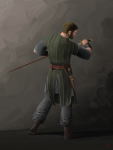
Okay, first thing first and I get this out of my chest: I hate chainmail, but I love how good it looks in the end. Wanted to make a little character concept art thingie. I dunno if I got it right, but I've been agonizing over this guy for days, searching for any flaw or thing that I could improve. Can't go any further so I said, "fuck it" and published it anyway.


Steapa finished portrait size.png


For those who don't know, it's Steapa, saxon warrior and a character from the Bernard Cornwell books, The Saxon Tales, adapted for the TV via The Last Kingdom series, and played by Adrian Bouchet, AKA Captain Drautos.

Fun fact: Don't follow the series since I can't have Netflix (bad internet, haha), aside fromt he YT snippets and what some of the actors tell through their social media. Some fan I am :awesome:
 
Glaurung, that's fantastic. You're so right to be pleased with the chain mail - it looks great. I know this series well, though I stopped watching it round about season 3 for some reason. The books are good. I love the sense of strength and sheer bulk you've given him, he really looks like a warrior.
 

BioTeach

Pro Adventurer
That turned out amazing! Good golly that chain maille would've driven me mad. Glad you had the patience to see it through.
 

Glaurung

Forgot the cutesy in my other pants. Sorry.
AKA
Mama Dragon
Glaurung, that's fantastic. You're so right to be pleased with the chain mail - it looks great. I know this series well, though I stopped watching it round about season 3 for some reason. The books are good. I love the sense of strength and sheer bulk you've given him, he really looks like a warrior.


Thank you! :properhug: I'm glad that I could convey how he's described in the books and how he looks in the series. To be fair, the actor is REALLY big, not only tall, but really bulky.

If you know the books, you'll have to know that S4 deviates from them.

As in, Steapa, who I've heard in the books gets to live a long life and retire with a bit of land, and die of old age... he gets killed in this season. In a rather insulting way, I might add. Maybe the producers and scriptwriters didn't know what to do with a character like him because he doesn't fit any mainstream mould.

Anyway, I've only read a bit of the three first books, and Steapa is one hell of a character, secondary as he might be.


That turned out amazing! Good golly that chain maille would've driven me mad. Glad you had the patience to see it through.

Thanks! I built it on Photoshop and made myself a custom texture. A whole day of work because I didn't know where to start, but it's worth it because now I have a proper, non-photographic texture I can work with.


But I'm also crossing my fingers so that this guy's next job involves either leather jerkin or plate mail :monster:
 
Are you a fan of the actor? He seems to be very active on Twitter with his fans. He and Crimsonsun are pals thanks to all the fanart Crim made of him, and I think they met at a Con.
 

Glaurung

Forgot the cutesy in my other pants. Sorry.
AKA
Mama Dragon
Yes I am. Became one because of Crim's drawings of the Kingsglaive and after I saw him at Kupocon with the rest of the movie crew. I don't know, there's something quite endearing about such a big guy being giddy about wearing a cool cosplay (to be fair, it was handcrafted especially for him), and about the way he celebrates Crim's fanart and interacts with his fans in general. I also follow him on Twitter, btw. I love how chill he is in general, and his brand of dry humor. I also love how his fans have nurtured an atmosphere of good humor and respect.


That might have influenced that I expanded a bit his role on my novelization and created extra scenes just to close his story arc but shhhh, don't tell anyone...


:awesome:
 

Glaurung

Forgot the cutesy in my other pants. Sorry.
AKA
Mama Dragon
Okay, a bit of shilling this time :awesome:

So, I'm taking part in a FFXV themed zine as a writer. We cover what might have happened in the ten year time skip on which Noctis was sleeping inside the Crystal. We are a total of 43 artists, between writers, artists, cosplayers and merch producers. All profit will go to the American Foundation for Suicide Prevention, and the pre orders start TODAY, spanning until 31st August.

Here's the twitter account, in case you might be interested: https://twitter.com/lostinwars

(Can't reveal anything, but I can tell you that what I've seen so far from other memebers is really, really good)

Oh, it's also a SFW themed zine (save for some mention of blood sometimes), and strictly non-shippy, since the focus is not on pairings, but on how characters might have coped with that long period of time.
 

Glaurung

Forgot the cutesy in my other pants. Sorry.
AKA
Mama Dragon
Ok, soooo, I made a cover for the first book of the novel, so I'll dump it here.

Cover 3.png

Painted the Kingsglaive logo following the official concept art, plus the background all in ArtRage (gods I L O V E the paint symetry feature). Then the lettering in Photoshop. Printing results in a 20cm or something wide thing, but that's on purpose so that when you print it in a A5 format you don't lose any quality.

Fonts used are "Final Fantasy" and Century Gothic Regular (the second one because it was a san seriff font and because it's the closest thing to the font used in the game menus).

I'm a complete noob at graphic design, so any input you might have will be more than welcome.
 

looneymoon

they/them
AKA
Rishi
Very nice! If I were going to give any input, I'm not a huge fan of how the texture of the BG sits behind the silhouette of the crest, and the crest backdrop contrasts with the front design. The lack of contrast (imo) is making things a little muddy for my taste, and I think the blending of the backdrop takes away from the strong contrast of the foreground rather than being enhancing.

There a few ways I think you could do to help this out. Personally, I would probably start with having a solid mid-tone background and work from there.

Seeing the design in small preview form is very helpful when it comes to this kind of stuff. When you're doing stuff like covers, things like silhouette and contrast should be at the forefront of what you're thinking about. Mimic what it would be like to see this from across the room. Does the design still read? Does everything pop like you want it to?

Graphic design isn't totally my forté, I'm mainly parroting stuff I know/can relay. I like it though, it's very cool.
 

Glaurung

Forgot the cutesy in my other pants. Sorry.
AKA
Mama Dragon
Thank you Looney!!

To be honest, I tend to blend things too much. I might try a background with a middle tone, as you suggested, and if I add any effect like shadowing, that it looks like paintstrokes, like what I did with the crest. I'll also try to lighten up a little bit the crest's centerpiece.

*rolls sleeves* Okay, here I go!
 

Glaurung

Forgot the cutesy in my other pants. Sorry.
AKA
Mama Dragon
All righty, sorry for the double post!

Cover 4.png


Enhanced the metal border with more contrast between light and shade, also toning down the colors to make it look like the grey metal that it's supposed to be.

The background now is a solid medium tone with shadow cast from the crest. Only when I finished I realized how muddy it really was. I have this tencendy to go for the greys and low-contrast, lol. The lettering keeps being grey because white jumped too much to your face.

Hope it now looks more pleasant :)
 

Odysseus

Ninja Potato
AKA
Ody
I'd personally probably make it a little brighter, but overall I think it's looking pretty good. I think the back might benefit from having some texture too it, though not as much as the last version you posted.
 
Top Bottom