You are using an out of date browser. It may not display this or other websites correctly.
You should upgrade or use an alternative browser.
You should upgrade or use an alternative browser.
TLS GFX
- Thread starter Tennyo
- Start date
X-SOLDIER
Harbinger O Great Justice
- AKA
- X
Not to mention that it's a subtle, and very important theme to FFVII.
I don't really see how adding a little floating Aerith in the background could be considered overkill.. (clarification?)
On a more technical note: So what all needs to be done before we can compose everything into a skin?
X
I don't really see how adding a little floating Aerith in the background could be considered overkill.. (clarification?)
On a more technical note: So what all needs to be done before we can compose everything into a skin?
X

Makoeyes987
Listen closely, there is meaning in my words.
- AKA
- Smooth Criminal
I like Aerith in the banner too.
Arianna
Holy, Personified
- AKA
- Katie; Seta.
Not to mention that it's a subtle, and very important theme to FFVII.
I don't really see how adding a little floating Aerith in the background could be considered overkill.. (clarification?)
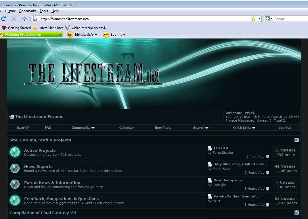
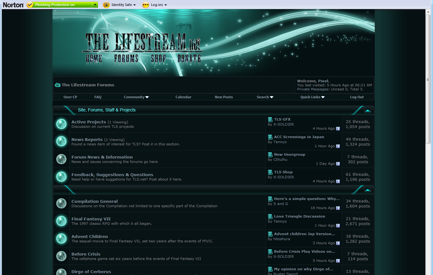
Eh - I just thought that - the website is called The Lifestream.Net and a glittering green graphic that portrays what's come to be very well known in the Final Fantasy fandom (or so I would think) as a visual representation of the Lifestream in the Compilation of FFVII...
Aerith's representation is kind of redundant as well as 'overkill' - I would think the title as well as the graphics would allow anyone to know it's a FFVII fansite. That's all.
It's just a feeling I get see it; there is no discounting Aerith in my comments, just her representation here for the website. Again, if it's what you want, go for it - I just thought to mention my opinions.
I like the work being done, either way - and will most likely use it.

Ⓐaron
Factiō Rēpūblicāna dēlenda est.
- AKA
- The Man, V
You can do that?In that case, never mind, just use this

yeah I don't remember the code for it offhand but it's pretty simple. That's how ACF did its banners as well, if memory serves correctly.
Rumpelstiltskin
Banned
- AKA
- L, Castiel, Scotty Mc Dickerson
I think he means the borders of all threads etc, its slightly more darker green than everything else on the board.
Having it match either the normal dark green or the very light green would prob make it look better.
Having it match either the normal dark green or the very light green would prob make it look better.


