AC/CC >> Remake Buster Sword Changes

Thenir

Pro Adventurer
AKA
Nirnaeth
I think they may have changed the Aerith scene because they wanted her to be clearly seen for those able to catch the reference, and the differences in design between Aerith from FFVII-R and the Compilation are a bit more distinct. The jacket, hair and ribbon are significantly different. Out of all the main characters, her outfit changed the most.
I think Aerith's dress changed more than others because the style of her CC/AC gown was absolutely unsuited for fighting or running or doing whatever but staying still.
 

jeangl123

Pro Adventurer
AKA
Jean
Love how this topic keeps coming back.


Normally I would never be so obnoxious as to correct such a small detail, but I have all this barely used FFVII knowledge in my brain, and this is a FFVII dedicated forum, so if not here, where?

That key art was revealed on January 31st 2017, the 20th anniversary of FFVII. Square Enix debuted it during the opening ceremony at its Final Fantasy 30th Anniversary celebration. I woke up in the middle of the night to watch a Japanese stream of the event, hoping for a new Remake trailer to drop. It didn't. I'd be waiting another 2 years and 4 months for that to happen. This key art is interesting in that it showcases a different, earlier design for Sephiroth. His pauldron is more detailed. They never updated the key art with Remake's current design, though they continue to use this image regularly. It bothers me to this day.
No worries that's my bad. Thanks for the correction!
 

jeangl123

Pro Adventurer
AKA
Jean
Forgot to add this here. The gold buster sword was in The First Soldier files. This is what it looks like.
unknown.png
unknown.png
 
Last edited:

Lex

Administrator
The first couple of pages of this thread will always be hilarious to me. People like

1670112252775.png

Thinking there were some shenanigans with the sword hilt. It's the same as the "7th Heaven Sign is Different" or "Not Wrong Skybox! Alternate Timeline!" theories that were virulent in the Chapter 18 spoiler thread right after remake released.

I'm buzzing for the next misadventure <3
 

hleV

Pro Adventurer
There's a mod where RBS gradually becomes CBS:
From the looks of it, the resulting CBS handguard is smaller in height than how it's depicted throughout Compilation. And it's a replacement rather than bolted handguard covering the gold one.
 

Elkazor

Pro Adventurer
AKA
Cinder Wing
As fun as this thread is, I am generally still confused as to why they changed the design back in the first place?

I love OG, and still have some problems with Compilation (Which, btw, as an update, I've actually warmed up to Advent Children and Crisis Core. I re-watched Advent Children - this time the Complete version, and I understand it a lot better despite still not really being interested in the nuances of Rufus' character being brought back. I also recently played Crisis Core for the first time due to my own curiosity getting the better of me, and I now embrace and consider it probably the best installment of the Comp, despite it's peculiar retcons and new inclusions. I still have a special spot for Before Crisis and Dirge, and have come to enjoy the whole Compilation for each respective thing they bring to the table.)

However, I always thought, even when I was first getting into the OG way back when after watching Advent Children, that the Compilation Buster Sword looked far superior to the OG Buster Sword. I always chalked up the OG design to hardware limitations, so the Comp design with a golden hilt felt like a really cool way to spiff up the old design and make it more special.
 

ForceStealer

Double Growth
Given the choice, I prefer the OG design, simply because I think the more frilly Compilation design clashes with the otherwise brutish design of the thing.

It's not something I ever felt strongly about, but a nice gold inlaid hilt on the end of a helicopter rotor always seemed more silly than a bunch of bolts, which feel more consistent with the brute force look. But I was happy to go along with either.
 

X-SOLDIER

Harbinger O Great Justice
AKA
X
The OG Buster Sword design matches a Cloud whose sense of fashion in putting bolts through his single shoulder pauldron jutting out awkwardly as a way to show he's an Ex-SOLDIER who doesn't play by Shinra's rules.

The AC Buster Sword design matches a Cloud whose sense of fashion is accessorizing himself with fancy metal sculpted wolf-head iconography as a way to show he's feeling emotionally detached & isolated from his friends.

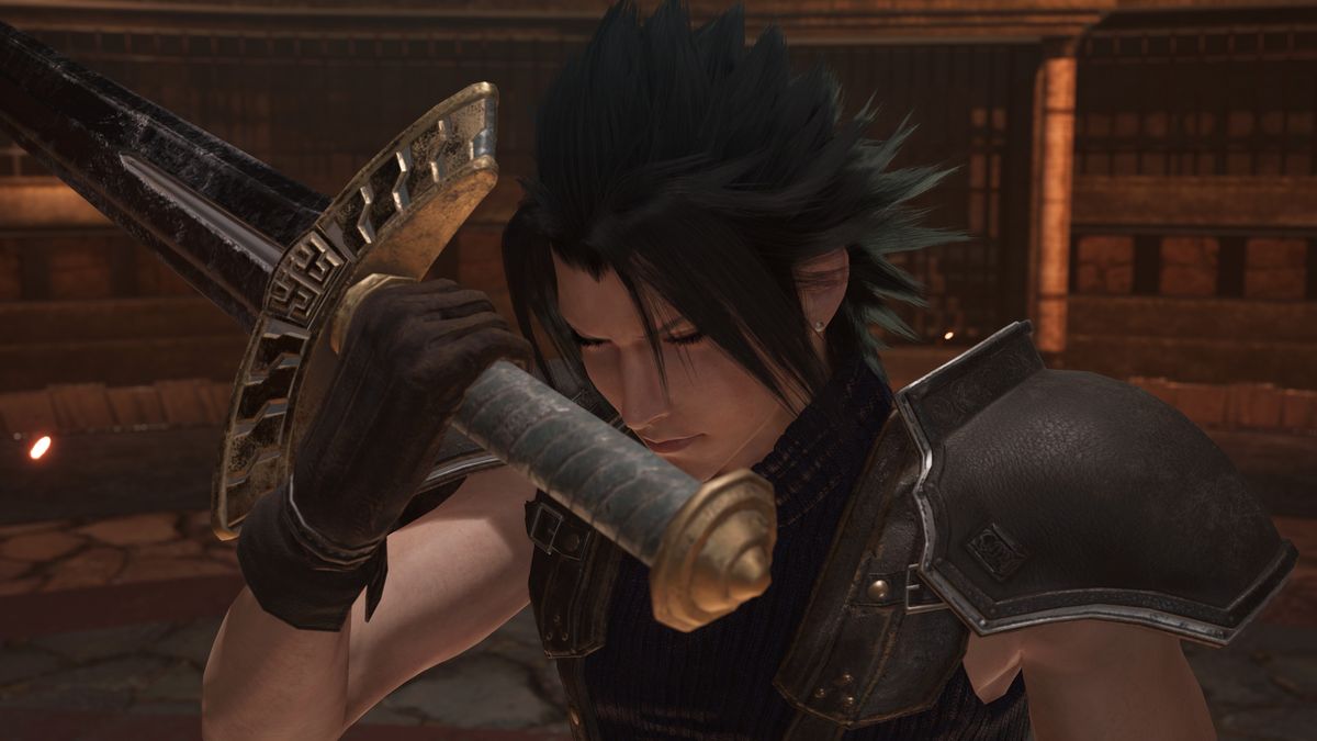
That's why when Crisis Core established it as the legacy item of Angeal and it kept the fancy design, it made sense that Zack would keep it as is, but it also felt like Remake Cloud would have been the kind of person to cover over the fancy design with something more brutally simplistic – hence all of this thread.

The fact that was meticulously removed from all of the cinematics in Crisis Core Reunion, but it's now present in Angeal's Ever Crisis art makes me really curious what their constraint is around which version gets used when, since some of the teams working on the projects have had to be CLEARLY aware of the two disparate designs but whether or not different projects' design/dev teams all get that in the same capacity is always hard to tell. Normally, I'd assume that the character portraits would be the most likely parts to be reviewed by Nomura or someone else in the design team who would be particular about that specific detail, but given the odd lack of consistency – who knows!!


X :neo:
 

jeangl123

Pro Adventurer
AKA
Jean

Makoeyes987

Listen closely, there is meaning in my words.
AKA
Smooth Criminal
Yeah, Takayuki did a lot of the designs in AC/C including the vehicles, creatures, and environment.

Wouldn't be surprised if he designed the hilt flourish. He also did the Sierra.
 

Ite

Save your valediction (she/her)
AKA
Ite
Ah yes probably the Bahamut Sin as well, all the bulbous swirly stuff that made AC not feel like FF7.
 
Top Bottom