
You are using an out of date browser. It may not display this or other websites correctly.
You should upgrade or use an alternative browser.
You should upgrade or use an alternative browser.
Dacon's Art
- Thread starter Max Payne
- Start date
Ravynne Nevyrmore
that one Lucrecia fangirl
- AKA
- Ravynne
That Clerith is amazing, and the one before it is nice too and obviously had a lot of work and effort put into it, but I've noticed how much better your line art is than your finished colored work. I think maybe your shading is a bit too smooth and a lot of it looks like you went happy with the Photoshop gradient tool. Maybe you should try experimenting with different colors being used together as light and shadow of the same object, too.
But the pencil work is total win. Maybe you should consider retaining more of the line art in the finished piece, too.
And don't "are you on pot" me, you asked for critique. =P
But the pencil work is total win. Maybe you should consider retaining more of the line art in the finished piece, too.
And don't "are you on pot" me, you asked for critique. =P
Last edited:
Max Payne
Banned
- AKA
- Leon S. Kennedy,Terry Bogard, The Dark Knight, Dacon, John Marston, Teal'c
I think maybe your shading is a bit too smooth and a lot of it looks like you went happy with the Photoshop gradient tool. Maybe you should try experimenting with different colors being used together as light and shadow of the same object, too.
I don't use gradients and I always experiment with different colors for light and shadow.
But the pencil work is total win. Maybe you should consider retaining more of the line art in the finished piece, too.
The line art didn't go anywhere.
And don't "are you on pot" me, you asked for critique. =P
ok are you on crack?
Ravynne Nevyrmore
that one Lucrecia fangirl
- AKA
- Ravynne
But it looks that way, whether or not that's how it was actually achieved. Too smooth and even.I don't use gradients
Experiment moar.and I always experiment with different colors for light and shadow.
I meant leaving it visible.The line art didn't go anywhere.
way to be humble.ok are you on crack?

Stop making excuses and just accept the criticism. You're good, but you're not perfect, and there's room to improve. Whoa, I guess you're just like the rest of us then.
 Acknowledge, utilize, move on. Disputing wastes everyone's time, especially yours.
Splintered
unsavory tart
This picture is amazing. Not just because the concept is awesome, but everything looks extremely proportioned and clean, all around well done. I like your art.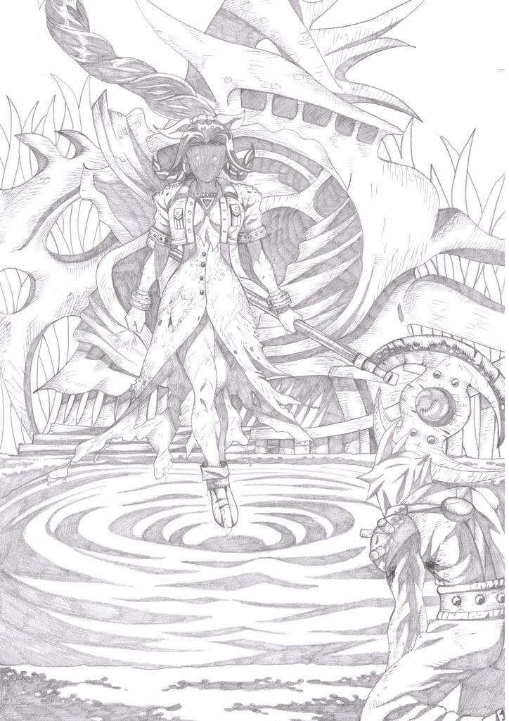
Just did this for shits and giggles.
Enjoy your undead flower girl.
Max Payne
Banned
- AKA
- Leon S. Kennedy,Terry Bogard, The Dark Knight, Dacon, John Marston, Teal'c
Durrr. The whole precipice art stands on is experimentation.Experiment moar.
It is visible. The only reason you can say it isn't is probably because you never saw the lineart without color.I meant leaving it visible.
way to take a joke.way to be humble.
No, fuck off. If I see something I don't agree with I'm going to voice my disagreement. Calling that "making excuses" does not somehow demean the points I make. If you disagree with something I'm saying you're welcome to say so, but don't insult my by accusing me of "making excuses" when I do the same.Stop making excuses and just accept the criticism.
NO SHIT. I am always acknowledging my failings, and there is always room to improve.You're good, but you're not perfect, and there's room to improve.
Save the fail lecture for someone who needs it, kthnxbai. You're just being unnecessarily patronizing now.Whoa, I guess you're just like the rest of us then.
No it doesn't. Debate over the specifics and structure of a work is just as beneficial as a day a of just practicing the simple basics.Disputing wastes everyone's time, especially yours.
Last edited:
Cookie Monster
NOM NOM NOM
Bro, your shading keeps getting better and better. That last work was fucking amazing.
Super Mario
IT'S A ME!
- AKA
- Jesse McCree. I feel like a New Man
Thank you, Big Boss..
trustnoevil
Selphie Chica
Your art is really amazing, Black Hand. I like the sort of comic-style you've got going on. Your pencil drawings are wicked. Good job, good job.
Max Payne
Banned
- AKA
- Leon S. Kennedy,Terry Bogard, The Dark Knight, Dacon, John Marston, Teal'c
Thank you, Big Boss..
for?
Max Payne
Banned
- AKA
- Leon S. Kennedy,Terry Bogard, The Dark Knight, Dacon, John Marston, Teal'c
Finally finished this picture, and I now have the means to properly describe my art "style" which is wholly uneven. The picture is meant to be inspired by RE5 and that's supposed to be the Spencer Estate in the background, but it just looks really shit. I spent a long time working on this pic and you wouldn't know it from looking at it.
I just noticed that the shadow on the top of Jill's boob blends in with Wesker's suit now that it's been scanned in, which just adds the cherry on top of the shit salad of bad proportions and ugly texturing. blah.

I just noticed that the shadow on the top of Jill's boob blends in with Wesker's suit now that it's been scanned in, which just adds the cherry on top of the shit salad of bad proportions and ugly texturing. blah.
aniron
it's me in a labyrinth
- AKA
- spirit chaser
Just did this for shits and giggles.
Enjoy your undead flower girl.
This one is quite powerful, I must say I never saw Aerith looking so fearsome before.
Great style, btw.
Max Payne
Banned
- AKA
- Leon S. Kennedy,Terry Bogard, The Dark Knight, Dacon, John Marston, Teal'c
I would have to agree that the estate could have been better and stuff. The characters look fucking awesome though.
really? cuz I honestly don't think so
Cat Rage Room
Great Old One
- AKA
- Mog
Wow Dacon, you're good as fuck.
Makoeyes987
Listen closely, there is meaning in my words.
- AKA
- Smooth Criminal
I bet Black Lantern Aerith would look sooooo hot. You seriously need to color that so I can hang it up in my room.
Cookie Monster
NOM NOM NOM
Finally finished this picture, and I now have the means to properly describe my art "style" which is wholly uneven. The picture is meant to be inspired by RE5 and that's supposed to be the Spencer Estate in the background, but it just looks really shit. I spent a long time working on this pic and you wouldn't know it from looking at it.
I just noticed that the shadow on the top of Jill's boob blends in with Wesker's suit now that it's been scanned in, which just adds the cherry on top of the shit salad of bad proportions and ugly texturing. blah.
The only problem I have with this piece is that shading seems incomplete. There's no shading on the building at all which makes it look flat compared to the rest of the work. The structure is pretty good tho. And, it seems like you got lazy on Wesker's pants, looks a bit flat there as well.
The detail on Wesker's upper body looks fucking amazing tho.
Max Payne
Banned
- AKA
- Leon S. Kennedy,Terry Bogard, The Dark Knight, Dacon, John Marston, Teal'c
I didn't "get lazy" it's meant to be completely cast in shadow. The image is at night, and there's no shading on the mansion because it's further in the background and I was trying to pull off that effect where things lose focus the further they are away from the camera, I realize that usually works better in color where you can blend it in more successfully.