You are using an out of date browser. It may not display this or other websites correctly.
You should upgrade or use an alternative browser.
You should upgrade or use an alternative browser.
NEW TRAILER: State of Play May 2019
- Thread starter Lex
- Start date
ForceStealer
Double Growth
I've always thought the going-into-their-arm thing was purely unique to the Remnants because they're basically just made of black cloudy essence.
Castiel Strife
Pro Adventurer
Hyped. As. Shit!!!!!!! Can not fucking wait. Can not FUCKING wait! If there is a God up above, please allow me to live long enough to see this release and play it to completion!!!
I don’t have a whole lot to say as far as specifics of the trailer, but holy shit. Not only did they show us a teaser, they also promised MORE next month in June. We know what that means. E3, baby!!! I expect to at least get a release window at E3. This game is going to be amazing. I’m still hyperventilating. It’s going to be worth the wait!!
I don’t have a whole lot to say as far as specifics of the trailer, but holy shit. Not only did they show us a teaser, they also promised MORE next month in June. We know what that means. E3, baby!!! I expect to at least get a release window at E3. This game is going to be amazing. I’m still hyperventilating. It’s going to be worth the wait!!
Cloud_S
Pro Adventurer
All 2,010 frames from the JP trailer (I find these are usually less compressed compared to their English counterparts, though the trailer as a whole is suffering from compression artifacts unfortunately).
Mega link for easy access and downloading: https://mega.nz/#F!aDYGXaYJ!Us7jX0hOOC7luXGAG7RBrA (if you download the entire folder it's 1.84 GB)
I also hope they'll fine-tune the animations because the Buster Sword clips right through Cloud:

Cloud also appears to have some type of device on the back of his belt in this portion of the teaser:

Mega link for easy access and downloading: https://mega.nz/#F!aDYGXaYJ!Us7jX0hOOC7luXGAG7RBrA (if you download the entire folder it's 1.84 GB)
I also hope they'll fine-tune the animations because the Buster Sword clips right through Cloud:

Cloud also appears to have some type of device on the back of his belt in this portion of the teaser:

Last edited:
X-SOLDIER
Harbinger O Great Justice
- AKA
- X


Interesting to see how they've updated the MPs (if of course these aren't variations we'll encounter, which would actually be a nice way to differentiate those you'll fight as you progress through Midgar).
I think it'd be really neat if these were variations. They definitely have a much more armored look and seem like they'd be likely to be guards, whereas the other MPs are more of the sorts that you'd expect just miscellaneously patrolling the streets. The addition of the forearm guards especially brings attention to the white parts of their armor in a way that feels like it's intentionally differentiated on their shoulders and helmets.
Given that these are the very first enemy types that you encounter, they're guarding the train station in front of the first Reactor (which you can see just afterwards). Their armor has a look like it's designed for them to be in an area that's actively under construction or in danger of falling debris. I wonder if we'll get differentiation between enemies that's sort of specialized around what type of role they're responsible for in Midgar, and where. It'd be really interesting to see these types of MPs be more common down in the slums and other places, whereas the more shiny & chrome ones are up on the plate and the authoritarian oppression is meant to blend in a bit to their surroundings.
While the trailer itself is VERY much a teaser, I think that this one's really REALLY satisfying to pick through.
I like that you seem to be able to assign commands to your characters, and easily swap between them during combat with L2/R2. The combat itself feels like the camera positioning and lock on are a bit... tighter? Not like it's less open, but like it's a little more focused. What's interesting is that you can target specific areas of enemies, but that doesn't guarantee that that's where you're going to land a hit, which is still a lot like FFXV.
When he goes to fight the Sweeper, you can see that Cloud's initially targeted on its body, but changes to its right arm just before he attacks, but the attack animation actually has the Buster Sword hit both of its legs when he swings, because it's pulled its arm back and out of the way. I also like in the UI that you can tell the difference on-screen between holding the button down, or see every time that a button press is registered.
We don't see the Commands Menu being used, but it is open when Cloud's attacking the camouflaged MP, and it normally exists behind the Circle button. It seems like that's going to have specific moves other than the standard Square/Triangle which seem to be their "free" combat actions, and the ability to block. It seems like having the Character Swap hidden while that menu isn't open may be to allow them to use the shoulder buttons for more things.
If I had to guess, this Command Menu is how they're going to bring a feeling of the original's Turn-based combat back, since that menu has actions associated with it, and we can see that bar rebuilding slowly over time in a couple of the shots. When it's open, it has the Square as "Braver" (as Cloud's got his Limit Break bar filled) as well as the Circle set to "Potions x9" This makes it feel like healing items are on a time-based delay that's different per-character. That means that it'll likely have a bit of tactical difficulty that FFXV's didn't with the ability to access essentially unlimited items at any moment that you wanted them. I'd be willing to bet that Materia-based actions are going to be in this menu as well.
Yeah... I'm definitely liking the look and feel of what they've got on display here. VERY much looking forward to them expanding more on it in June to see if I'm on the mark with any of this at all.
X

looneymoon
they/them
- AKA
- Rishi
I am especially pleased with how they handled the boss!!
It's so wonderfully exaggerated, I hope the rest of the creature design/animation is as on point as this.
It's so wonderfully exaggerated, I hope the rest of the creature design/animation is as on point as this.
Knuxson
Pro Adventurer
It sounds a lot like him at least. I just hope they make sure to make Cloud cocky and arrogant in the beginning of the game unlike Advent Children Cloud so we can see the change in his character between the beginning and end of the game. Hopefully Steve gets some good notes on how the character is supposed to act at first so that he plays up that side of him instead voicing him all melancholy.
ForceStealer
Double Growth
Aps looks so, so good.


Tetsujin
he/they
- AKA
- Tets
I watched a bunch of Max's stream while I was processing thoughts, and he finally uploaded his video from it.
X
His reaction at 15:15 with the music swelling up is such perfect timing, you'd think it was edited but it wasn't.

Obsidian Fire
Ahk Morn!
- AKA
- The Engineer
We saw that in Crisis Core. Sephiroth had an entire fan club devoted to him which just so happened to be run by Hojo...
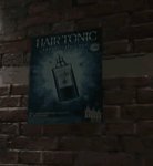
We know what Sephy's shampoo is
View attachment 2978
What in the hell is that?
Celes777
Pro Adventurer
- AKA
- ...
This is a screenshot from the teaser video.What in the hell is that?
In Crisis Core if you join Sephiroth's fan club, one email says he uses one entire bottle of shampoo and conditional whenever he washes his hair. LOL
Celes777
Pro Adventurer
- AKA
- ...
Thats hella creepyWe saw that in Crisis Core. Sephiroth had an entire fan club devoted to him which just so happened to be run by Hojo...
Tetsujin
he/they
- AKA
- Tets
LicoriceAllsorts
Donator
Why is Sephiroth appearing at the reactor explosion? Is Cloud hallucinating? Did they intercut footage from Nibelheim?
LicoriceAllsorts
Donator
Well spotted Celes (or whoever spotted that flyer)
Cloud_S
Pro Adventurer
So I found a few images that clearly weren't taken from the YouTube'd trailer on an article for IGN Spain (haven't found a counterpart on IGN US).
Direct link to the gallery: https://es.ign.com/final-fantasy-vi...make-imagenes-del-primer-trailer-con-gameplay (it should go without saying that images without "screenshot" in the filename are those that SE must've given out for article purposes)
Comparing them more, especially the one of Aerith (note the hair, shadowing, etc) these are either pre-rendered to look the best they can, or perhaps from a more advanced, more polished version from however long after the yesterday's teaser was made (hoping for the latter)?
Trailer:

IGN:

Trailer:

IGN:

Trailer:

IGN:

Trailer:

IGN:

Trailer:

IGN:

Trailer:

IGN:

Direct link to the gallery: https://es.ign.com/final-fantasy-vi...make-imagenes-del-primer-trailer-con-gameplay (it should go without saying that images without "screenshot" in the filename are those that SE must've given out for article purposes)
Comparing them more, especially the one of Aerith (note the hair, shadowing, etc) these are either pre-rendered to look the best they can, or perhaps from a more advanced, more polished version from however long after the yesterday's teaser was made (hoping for the latter)?
Trailer:

IGN:

Trailer:

IGN:

Trailer:

IGN:

Trailer:

IGN:

Trailer:

IGN:

Trailer:

IGN:

Odysseus
Ninja Potato
- AKA
- Ody
Haven't seen anyone mention this yet, but I really liked the range of expression you see on Cloud's face after he says "I'm fine" to Aeirth. You can see a whole thought process go through his mind before she gets in front of him again. It really stood out as impressive to me.
LicoriceAllsorts
Donator
Yes, that's really well done. The expressiveness will win me over.
LicoriceAllsorts
Donator
I can't believe we live in a world where there is new FFVIIR footage.
State of Play? More like State of SHOCK.
'Tis a pity I can't look over everything until I get home from work in seven hours.
Get a job where you can set your charges an assignment and then spend the lesson pouring over FFVII social media while they work quietly.

