You are using an out of date browser. It may not display this or other websites correctly.
You should upgrade or use an alternative browser.
You should upgrade or use an alternative browser.
On Forum Titles and Roles - Important!
- Thread starter Lex
- Start date
fancy
pants
- AKA
- Fancy

Somebody give me a comprehensible list of something so I can start designing the things! It’s my off day and I’m here to sip soju and draw for TLS. And I’m all out of soju.

LMAO JK CAN NEVER HAVE ENOUGH OF THAT SHIT but seriously.
Do we want to have mini stickers of the main nine characters and assign roles based on that? Just stick with objects maybe?
How’s this list
- Admin - Buster Sword
- Mod - Masamune (with a feather to indicate that its Sephiroth’s lmao)
- Staff Emeritus - (are we even keeping this one) Cosmo Canyon Observatory
- Great Old One - Jenova’s head. Cuz she’s old. Lmao. Or like, Cthulhu, idk. (Or Jenova’s eyeboob, wink wink, thanks Tetsujin lmao
 )
) - Donators - ShinRa Logo (cuz dollah dollah bills y’all)
- Content Contributers - Materia (or HMMM the Highwind if we’re looking for more ffvii-centric themes?)
- BANNED - the train that runs into Corel. Also, I’m kidding. (tho Minato suggested Rocket #26!)
Last edited:
Fangu
Great Old One
YAASSS give me these already plz
- Staff Emeritus - (are we even keeping this one) Cosmo Canyon Observatory
- Great Old One - Jenova’s head. Cuz she’s old. Lmao.
- Donators - ShinRa Logo (cuz dollah dollah bills y’all)
Cthulhu
Administrator
- AKA
- Yop
What I would like to propose is that we give the things a uniform style and border of sorts, so that visually it flows nicely. Channy for example has these MSN and AIM icons in her postbit, if there were e.g. a masamune next to it, it'd look er, weird? TL;DR the icons should have the same size.
And we should probably determine a size, . I'm thinking four in a row at most?
And we should probably determine a size,
 . I'm thinking four in a row at most?
fancy
pants
- AKA
- Fancy
Oi, to be clear, I was gonna draw them all on a button in a 500px by 500px file. Figured you lot would resize them from there to make them nice, smol, uniformed badges/buttons with cute little images in them. Will look a bit like the trophies you unlock on Steam except they’re all gonna be circles n shit.
Was sketching and the masamune doesn’t look too impressive in such small form tho lmao. Might do the one winged thing instead. I’ll upload some sketches sometime this week if you lot are fine with that? And you’ll see what I mean. <3
Was sketching and the masamune doesn’t look too impressive in such small form tho lmao. Might do the one winged thing instead. I’ll upload some sketches sometime this week if you lot are fine with that? And you’ll see what I mean. <3
Cthulhu
Administrator
- AKA
- Yop
Yeah that makes sense, we could have larger versions on a profile page,  . Something tells me this'd be a custom feature though, or maybe there's a plugin system for it, we'll have to check.
There's also the thing where high DPI screens (mobile, etc) can request a 2x resolution version. Alternatively, SVGs.
 . Something tells me this'd be a custom feature though, or maybe there's a plugin system for it, we'll have to check.
There's also the thing where high DPI screens (mobile, etc) can request a 2x resolution version. Alternatively, SVGs.
Lex
Administrator
^It'll require custom CSS <3
This is why I suggested the materia orbs, we want some degree of uniformity so it doesn't look like clutter
So from that angle I feel like we should be going for things that are more recognisable badges like as suggested the Shinra logo, Soldier logo etc. but there's no harm in doing mock ups of some other stuff and seeing how it looks? For reference here is a postbit on XF:

The icons will go in either of the places highlighted in red. I prefer the space between the avatar and the username.
This is why I suggested the materia orbs, we want some degree of uniformity so it doesn't look like clutter

So from that angle I feel like we should be going for things that are more recognisable badges like as suggested the Shinra logo, Soldier logo etc. but there's no harm in doing mock ups of some other stuff and seeing how it looks? For reference here is a postbit on XF:

The icons will go in either of the places highlighted in red. I prefer the space between the avatar and the username.
fancy
pants
- AKA
- Fancy
buttons for days
okay so i don't have a protoype of errthang i listed.
but i will NOT be made a liar, dammit, i said i'd poast this week so here i am.
first of all, everyone please give a round of applause to B and pay tribute to her in cheeses, soy lattes, sexual favours, whatever she wants bc she collabed with me in this creative effort and if she hadn't been helping me with the linearts, then TBH i would've been fucked and probably not posting this week.
right so here we go.
What do we think? Note that the polished versions of whatever we end up using will look a lot more, well, polished and not so like ROUGH N SHIT like the Jenova, i literally took the black and white sketch and put it on multiply so i could colour it, but if we kept the Jenova head, I'd fine tune that shit, obvs.
kk, ty in advance for your thoughts and feedback. :3
okay so i don't have a protoype of errthang i listed.

but i will NOT be made a liar, dammit, i said i'd poast this week so here i am.

first of all, everyone please give a round of applause to B and pay tribute to her in cheeses, soy lattes, sexual favours, whatever she wants bc she collabed with me in this creative effort and if she hadn't been helping me with the linearts, then TBH i would've been fucked and probably not posting this week.

right so here we go.
Buster Sword (for Admins, possibly)
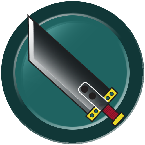
So I was thinking the back colour of these buttons could be lifestreamy greens. I did this for masamune and the soldier logo.
Masamune (for Moderators I think lmao)

Doesn't look as sexy as the others bc it isn't as thicc but it has potential.
SOLDIER Logo (for Admins innit?)

Competing with Buster Sword for Admin button eh?
Shinra Logo (for Donators)
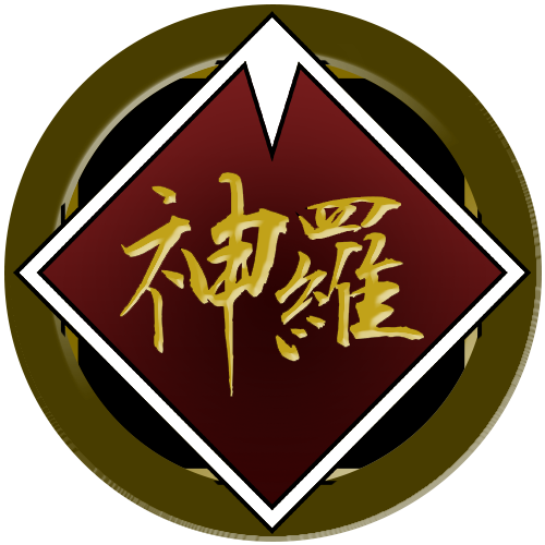
This is probably one of the better-looking ones aesthetically tbh. And as you can see, I changed the colour of the button just because.
Jenova's Head (for Great Old Ones)

Sorry, no eye boob.
B YOU ARE LIKE A GODDESS SHE DREW THIS.
Anyway, yeah.

So I was thinking the back colour of these buttons could be lifestreamy greens. I did this for masamune and the soldier logo.
Masamune (for Moderators I think lmao)

Doesn't look as sexy as the others bc it isn't as thicc but it has potential.
SOLDIER Logo (for Admins innit?)

Competing with Buster Sword for Admin button eh?
Shinra Logo (for Donators)

This is probably one of the better-looking ones aesthetically tbh. And as you can see, I changed the colour of the button just because.
Jenova's Head (for Great Old Ones)

Sorry, no eye boob.

B YOU ARE LIKE A GODDESS SHE DREW THIS.
Anyway, yeah.
What do we think? Note that the polished versions of whatever we end up using will look a lot more, well, polished and not so like ROUGH N SHIT like the Jenova, i literally took the black and white sketch and put it on multiply so i could colour it, but if we kept the Jenova head, I'd fine tune that shit, obvs.
kk, ty in advance for your thoughts and feedback. :3
Last edited:
Channy
Bad Habit
- AKA
- Ruby Rose, Lucy
holy shit balls that Jenova head is seriously bitchin. So glad I'm a Great Old One 
I kinda think maybe Masamune and Buster Sword should be swapped? I mean, Cloud was just a grunt and Sephiroth was the great one so... der
I come from a simpler time when we had MSN and AIM and I refuse to give up those icons. It makes me feel nostalgic.
I'm also fond of the between avi and username idea.

I kinda think maybe Masamune and Buster Sword should be swapped? I mean, Cloud was just a grunt and Sephiroth was the great one so... der

What I would like to propose is that we give the things a uniform style and border of sorts, so that visually it flows nicely. Channy for example has these MSN and AIM icons in her postbit, if there were e.g. a masamune next to it, it'd look er, weird? TL;DR the icons should have the same size.
I come from a simpler time when we had MSN and AIM and I refuse to give up those icons. It makes me feel nostalgic.

The icons will go in either of the places highlighted in red. I prefer the space between the avatar and the username.
I'm also fond of the between avi and username idea.
fancy
pants
- AKA
- Fancy
holy shit balls that Jenova head is seriously bitchin. So glad I'm a Great Old One
Isn’t it amazin? I was serious when I suggested we pay b in sexual favours.
 .
.I kinda think maybe Masamune and Buster Sword should be swapped? I mean, Cloud was just a grunt and Sephiroth was the great one so... der
MMMM!! YEH I SEE YOUR POINT BUH LIKE
Methinks, of the two, the Buster Sword is the more iconic weapon and thus holds more weight. Hero’s sword n all that. Besides! Cloud only began using it not when he was still fighting like a grunt, but like a 1st Class SOLDIER (after all of the mind fuckery and the five years of being involuntarily experimented on and the torture n shit
 ).
). (。・ω・。
 ノ
ノ
Last edited:
Channy
Bad Habit
- AKA
- Ruby Rose, Lucy
Isn’t it amazin? I was serious when I suggested we pay b in sexual favours..
My body is hers to abuse

MMMM!! YEH I SEE YOUR POINT BUH LIKE
Methinks, of the two, the Buster Sword is more iconic weapon and thus holds more weight. Hero’s sword n all that. Besides! Cloud only began using it not when he was still fighting like a runt, but like a 1st Class SOLDIER (after all of the mind fuckery and experiments and the bodily torture n shit).
(。・ω・。)ノ
MMKAY BUT BRUH LIKE THIS
He wasn't technically a 1st Class SOLDIER ever

Roger
He/him
- AKA
- Minato
holy shit balls that Jenova head is seriously bitchin. So glad I'm a Great Old One
Isn’t it amazin? I was serious when I suggested we pay b in sexual favours..
I kinda think maybe Masamune and Buster Sword should be swapped? I mean, Cloud was just a grunt and Sephiroth was the great one so... der
MMMM!! YEH I SEE YOUR POINT BUH LIKE
Methinks, of the two, the Buster Sword is more iconic weapon and thus holds more weight. Hero’s sword n all that. Besides! Cloud only began using it not when he was still fighting like a runt, but like a 1st Class SOLDIER (after all of the mind fuckery and experiments and the bodily torture n shit).
(。・ω・。ノ
Well, he did do some battling with it as a grunt. Main involving oneshotting Sephiroth as a 16-year old.
Also OMG, those lpok great Fancy!!!

Thank you for the help B!!!

ForceStealer
Double Growth
Those are bitchin', well done 
I also love our FF7-ized AIM, MSN, and ICQ buttons, it's a shame they're obsolete now, haha.

I also love our FF7-ized AIM, MSN, and ICQ buttons, it's a shame they're obsolete now, haha.
InterfaceLeader
Pro Adventurer
Those icons look amazing! I love them!!
fancy
pants
- AKA
- Fancy
moar buttons??
my date cancelled on me so, consequently, i suddenly had all this extra time to work on making more buttons
lemme tell you upfront that this set is a hell of a lot uglier than the first bc it was just me scribbling up some ideas and colouring n shit. it made me appreciate B 1000% more than i already did. ty for the simple and clean lineart babe.
anyway
Right right, same deal, give me your thoughts. As you can see, I experimented some more with different button colours. Merci!
my date cancelled on me so, consequently, i suddenly had all this extra time to work on making more buttons

lemme tell you upfront that this set is a hell of a lot uglier than the first bc it was just me scribbling up some ideas and colouring n shit. it made me appreciate B 1000% more than i already did. ty for the simple and clean lineart babe.
anyway
Rocket 26 (for BANNED)
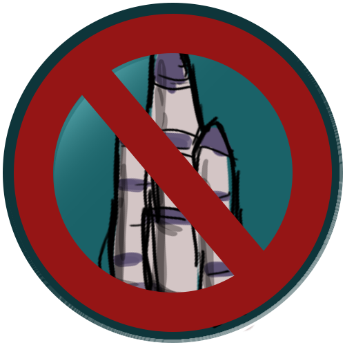
Behold this vaguely phallic looking creature.
FENRIR Wolf (for WHO THE FUCK KNOWS)
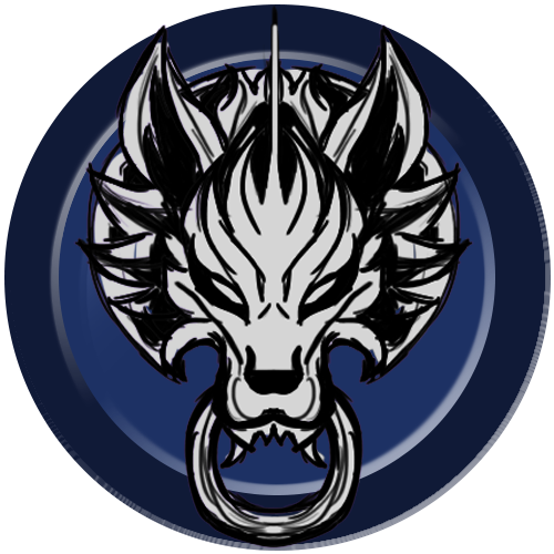
Bit of a controversial one I guess, lmao, since this is an ac(c) symbol rather than an og one (correct me if I'm wrong). Regardless, I was struggling to come up with FFVII-centric symbols and this was one of the distinguished few. I tried to make the wolf look a little more chibi I guess? Reminds me a bit of Nanaki...
What Looks To Be An Attempt At Drawing Meteor (for I dunno)

I am honestly embarrassed to be posting this but I FUCKING FELT LIKE I HAD TO in order to convey an idea lmao. Ignore the hideousness, it's gonna look better if we decide to run with it.
The Highwind (for Content Creators Possibly)
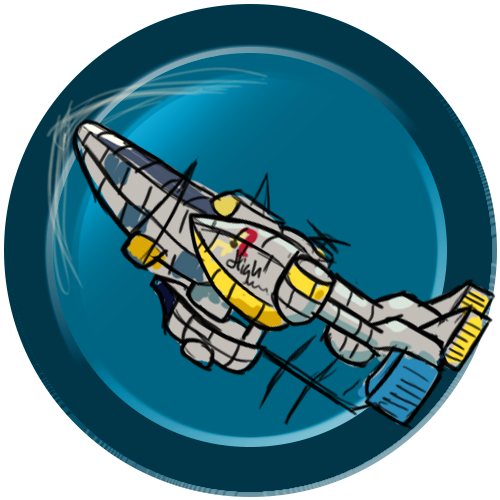
Something else I tried to chibi-fy a widdle bit. It's so cute!! I like this one.
Cosmo Canyon Observatory (for Staff Emeritus)
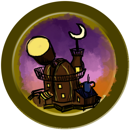
I'm actually proud of this button lmao. Cue the Cosmo Canyon song!

Behold this vaguely phallic looking creature.
FENRIR Wolf (for WHO THE FUCK KNOWS)

Bit of a controversial one I guess, lmao, since this is an ac(c) symbol rather than an og one (correct me if I'm wrong). Regardless, I was struggling to come up with FFVII-centric symbols and this was one of the distinguished few. I tried to make the wolf look a little more chibi I guess? Reminds me a bit of Nanaki...
What Looks To Be An Attempt At Drawing Meteor
 (for I dunno)
I am honestly embarrassed to be posting this but I FUCKING FELT LIKE I HAD TO in order to convey an idea lmao. Ignore the hideousness, it's gonna look better if we decide to run with it.
The Highwind (for Content Creators Possibly)

Something else I tried to chibi-fy a widdle bit. It's so cute!! I like this one.
Cosmo Canyon Observatory (for Staff Emeritus)

I'm actually proud of this button lmao. Cue the Cosmo Canyon song!
Right right, same deal, give me your thoughts. As you can see, I experimented some more with different button colours. Merci!
Last edited:
Mother
Pro Adventurer
- AKA
- B
Omg BITCH!!!!! These are amazing! I loooooove them, especially how the meteor, Cosmo Canyon and Highwind buttons turned out. They're all you, babe! I can't tell you enough how beautifully your efforts have turned out.
Possible improvements:
I accept any and all offers for sexual favours for all past, present and future projects I participate in. If this is what it takes I'll draw the whole goddamn forum.
PS: Who dares cancel their date with you!? Lemme at em! Lemme at em!!!!!!

Possible improvements:
1. The button colour - Lifestream Green may not be the best colour to go for as it might blend in with the Xf forum's default colour palette. I would suggest a contrasting colour, like purples/reds/oranges/yellows.
2. Try playing around with the width of the outer rim of the button, like making it a little thinner for a cleaner look?
2. Try playing around with the width of the outer rim of the button, like making it a little thinner for a cleaner look?
I accept any and all offers for sexual favours for all past, present and future projects I participate in. If this is what it takes I'll draw the whole goddamn forum.
PS: Who dares cancel their date with you!? Lemme at em! Lemme at em!!!!!!

Flare
Pro Adventurer
- AKA
- Flare
These are really looking nice!  My main thought right now, how do they look at much smaller sizes? Like, would the Cosmo Canyon show up clearly, for example?
Also what about a black feather or the black wing to represent Sephiroth instead of the Masamune?
Also also, could maybe do the ultima weapon (the one cloud wields) instead for admins, and make mods with the buster sword? Hmm idk idk! I'm flashing back to those updated cookie monster award trophies we made
 My main thought right now, how do they look at much smaller sizes? Like, would the Cosmo Canyon show up clearly, for example?
 Also what about a black feather or the black wing to represent Sephiroth instead of the Masamune?
Also also, could maybe do the ultima weapon (the one cloud wields) instead for admins, and make mods with the buster sword? Hmm idk idk! I'm flashing back to those updated cookie monster award trophies we made

Lex
Administrator
Badges looking fantastic - can't individually talk about them now due to time constraints but I echo the concern about how they'll look shrunk down, and for that reason I think we should stick to the more iconic/ less detailed logos (soldier logo, masamune, buster sword, meteor, wolf etc) but we can trial them all and see how they look for sure before making any solid decisions in that respect.
I'll give more detailed input in a bit
I'll give more detailed input in a bit

fancy
pants
- AKA
- Fancy
Possible improvements:
1. The button colour - Lifestream Green may not be the best colour to go for as it might blend in with the Xf forum's default colour palette. I would suggest a contrasting colour, like purples/reds/oranges/yellows.
I like this suggestion.
2. Try playing around with the width of the outer rim of the button, like making it a little thinner for a cleaner look?
Imma give it a go!
Also what about a black feather or the black wing to represent Sephiroth instead of the Masamune?
Hell, why not!
Also also, could maybe do the ultima weapon (the one cloud wields) instead for admins, and make mods with the buster sword? Hmm idk idk! I'm flashing back to those updated cookie monster award trophies we made
Nah that’s a legit idear! And if we’re running with more simple shit, I’m thinking we could utilise the nail bar for either newbies or BANNED
 .
.Amazing. These are going to look great on the new forum.

These are really looking nice!My main thought right now, how do they look at much smaller sizes? Like, would the Cosmo Canyon show up clearly, for example?
Badges looking fantastic - can't individually talk about them now due to time constraints but I echo the concern about how they'll look shrunk down, and for that reason I think we should stick to the more iconic/ less detailed logos (soldier logo, masamune, buster sword, meteor, wolf etc) but we can trial them all and see how they look for sure before making any solid decisions in that respect.
I'll give more detailed input in a bit
They’re going to show up as 50x50 px on the forum eh? I’m gonna take a small nap, but later today (hopefully within the next couple of hours), I can just post everything scaled down.

fancy
pants
- AKA
- Fancy
fuckin' buttons man.
^'lmfao @ i'll be back in a few hours lmao' i didn't even nap
anyway, here's how the icons looks 50x50

....I think
I uploaded it so that the file size wouldn't be resized but it's looking a widdle big to me. idk.
ANYWAY.
Put in Ultima, the bat, fixed up Cosmo Canyon. Shout out to Flare Bear for reminding me that she already made a render of Ultima and the nail bat for the TLS awards, so those are her works there. Shout out to my wife B for working so hard on the cosmo canyon lineart only for me to cut off most of it to show the dome LOL. Also shout out to wifey for suggesting the shit in the badges poke out a little out of the badges n shit. Makes it look moar dynamic.
Okay, so I went with B's suggestion to do just purple, red, yellow, and orange to pop against the lifestream colours.
I just came up with this random ranking:
Purple - Admins
Orange - Mods/Old Ones
Red - Donators
Yellow - Contributors/Lower Staff/Ex-Staff
^'lmfao @ i'll be back in a few hours lmao' i didn't even nap

anyway, here's how the icons looks 50x50

....I think

I uploaded it so that the file size wouldn't be resized but it's looking a widdle big to me. idk.
ANYWAY.
Put in Ultima, the bat, fixed up Cosmo Canyon. Shout out to Flare Bear for reminding me that she already made a render of Ultima and the nail bat for the TLS awards, so those are her works there. Shout out to my wife B for working so hard on the cosmo canyon lineart only for me to cut off most of it to show the dome LOL. Also shout out to wifey for suggesting the shit in the badges poke out a little out of the badges n shit. Makes it look moar dynamic.
Ultima Weapon (for ADMINs)
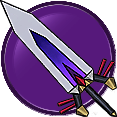
Another contender for admins.
Nail Bat (for NEWBIES??)
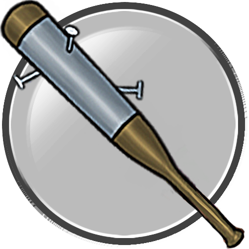
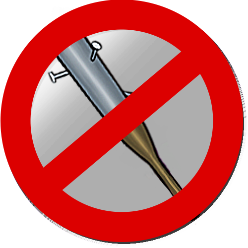
lmao poor newbs. I was also thinking maybe
Cosmo Again (for Staff Emeritus again I guess. IDK I just wanna use it IT'S SO PRETTY)

^see above

Another contender for admins.
Nail Bat (for NEWBIES??)

lmao poor newbs. I was also thinking maybe

Cosmo Again (for Staff Emeritus again I guess. IDK I just wanna use it IT'S SO PRETTY)

^see above

Okay, so I went with B's suggestion to do just purple, red, yellow, and orange to pop against the lifestream colours.
I just came up with this random ranking:
Purple - Admins
Orange - Mods/Old Ones
Red - Donators
Yellow - Contributors/Lower Staff/Ex-Staff
