• There are currently leaks out on the internet for FFVII Rebirth; we have received legal notice about these being posted on the forums. Do not post any images, videos, or other media, or links to them from FFVII Rebirth or the artbook. Any leaked media or links to them will be deleted.Repeat offenders will be suspended.
    Please help us out by reporting any leaks, and do not post spoilers outside of the spoiler section.

On Forum Titles and Roles - Important!

BforB

Pro Adventurer
AKA
B
YASSSS!!! That Cosmo Canyon badge can get itttt. Even if we forgo the Staff Emeritus title, we could probably allocate it to another title :P
 

InterfaceLeader

Pro Adventurer
They all look SO GOOD. And I didn't think the Cosmo Canyon one would look clear when it was shrunk down, but it actually looks great.

The only one I'm not sure about is the nailbat with the 'nope' circle, I think it obscures too much of the bat so it's not clear what it is (the fully visible nailbat is great).
 

fancy

pants
AKA
Fancy
Mm, dat Ultima Weapon.

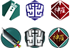
I love how they overflow a bit off the 'edge' of the icon.

Sexy yeah? I was honestly leaning towards either that or the Buster Sword to be the admit badge. Now I’m thinking Buster Swords might be for the mods whilst Admins get Ultima :megusta:

And yessss, B was suggesting the objects ‘overflow’ completely. Maximises what you see.

Dats some F A N C Y (;) ) buttons!

I want one.

LOL!
i-see-what-you-did-there-gif.gif


Hype!

They all look SO GOOD. And I didn't think the Cosmo Canyon one would look clear when it was shrunk down, but it actually looks great.

The only one I'm not sure about is the nailbat with the 'nope' circle, I think it obscures too much of the bat so it's not clear what it is (the fully visible nailbat is great).

OMG B AND I WERE LIKE DETERMINED TO MAKE COSMO CANYON WORK THIS MORNING/(her evening)!! It was looking hideous but I think we finally got it to a point that’s passable. Soooooo happy <3

B was saying something similar re:ban badge! Might just take the bat out entirely and just leave the ‘nope’ circle? Like, the banned folks don’t get anything special because FUCK THEM THEY’RE BANNED :mon:
 

Lex

Administrator
They'll be smaller than 50x50. Probably somewhere around 15x15.

I like the colour idea but can we see them in the original TLS style colours aswell? That way we can compare the two, it might be nicer to go for a more monochromatic look rather than having colours that pop :)

Again looking great, fab work <3
 

Channy

Bad Habit
AKA
Ruby Rose, Lucy
I think maybe one overall colour that pops (a little?) for the icons so they don't get lost in the background, especially if they'll go down to 15x15 or 20x20... the purple is really nice, maybe a slightly darker purple?

Also, when they get shrunk down, the effect of the "metallic edge" on the button sort of gets lost and pixelated, maybe this should be darker to look cleaner?

Minor suggestions for such beautiful pieces :monster: <3
 

BforB

Pro Adventurer
AKA
B
So taking on Lex and Channy's feedback, we've come up with another potential set of icons for a more clean, modern, uniform look. Have only managed to come up with three at this moment, but we would love to get some feedback on these before we make more :mon:

25smallicon_bustersword.png
25smallicon_shinra.png
25smallicon_soldier.png


icon3_bustersword.png


icon2_shinra.png


icon_soldier.png

Side note: While I like the look of the buster sword against the Lifestream Green badge, would it blend in a little too well with the rest of the colour scheme on Xf?
 

fancy

pants
AKA
Fancy
They'll be smaller than 50x50. Probably somewhere around 15x15.

:closedmonster:

So, I was right in thinking that they looked a little big after all. :monster:

Resized properly...
v_smol.png


*tries not to cry, cries a lot* :alone:

Yeah, I dunno if that would work after all. B's might be the safer bet. Looks proper modern as well. We'll see when it's resized.

EDIT:
I took the liberty of resizing your set B. :mon:
v_smol_b_button.png


EDITED EDIT:
The current icons used on xf are 25x25 (see Lex's thing on https://thelifestream.net/xforums/i...nforo-testing-thread.20557/page-4#post-787231), that will fit 4 of them side by side. 50x50 would be possible but then 4 of them will be as big as the avatars are atm, which might be a bit much.

I'm concerned personally that the postbit will start looking a bit cluttered if there's >4 icons on there, :monster:.

FUCKITY FUCK how did I miss this :wacky:

Lemme resize these once more.

EDITED EDITED EDIT:

Both sets resized at 25x25 px
kinda_smol_buttons.png
 
Last edited:

Flare

Pro Adventurer
AKA
Flare
I have to admit, I love the stylized simplicity of the ones B posted. It definitely gives things a more modern feel and is easier to see! Although the designs are still a bit hard to make out at such a small size. Hmmm.
 

InterfaceLeader

Pro Adventurer
I think having 4 max at 50x50 looks good on the new forum.

BUT I also like the fact the cookie monster fake ones on the test thread are square. It makes it a pleasing grid, and also means the shape of the icon isn't adding distracting angles into the overall layout.

(I also think it might help with the overall clarity of the icons when they are shrunk down?)
 

Fangu

Great Old One
I took a look at xf and changed the width and height a little, imo 50px is a bit too big. Something between 25 and 35 looks okay to me, although 35 is pushing it. That being said I think 25 is too small to do the icons justice.

Re: placement in the postbit - do remember to check where it lands on mobile. As it is now it lands under the user's user name right before their title. Which looks fine to me, but needs to be checked off.

I think consistently using Lifestream green as a background looks the best, it makes the motives themselves pop more :monster:
 

Geostigma

Pro Adventurer
AKA
gabe
I have to agree with Fangu that 50px is far to large especially along side XF's minimalist aesthetic. They look great though.

I'm curious what they would look like with someone who has to many roles etc. lol. Like Yopy pointed out its a bit concerning thinking about how funky a postbit would look like in that circumstance.

I'm assuming since XF won't stretch the postbit it would just make a second line and leave an uneven amount of Icons on there huh? lol
 

Cthulhu

Administrator
AKA
Yop
I think we started off at roughly 35px; the default style for the user titles thing is that they're bars, one underneath the other, which I changed to icon + text at first (or which I can change to icon+text). Takes up quite a bit of spaec though.

That said, I really like some of the ones at 25x25; the weapons are recognizable enough. The shinra and soldier logos are a bit too smol though, hard to recognize as such. Although the soldier one on the left side works, as does the wolf dude.

An eyeboob would still work, :monster:
 

Fangu

Great Old One
I think the shinra with green background looks fine tbh - if you know ff7 you'll know what it is :monster:
 

BforB

Pro Adventurer
AKA
B
Re: making the colours uniform, I think that aesthetically works for the badges that Fancy first did where the item on the badge itself is fully coloured, because each item still has its own distinctive features. I don't personally think that would be as effective for the badges I did, however, because the 2D white shapes don't have the same visually associative triggers that colours do. Of course, if this isn't really an issue then s'all good.

I gave them all an update so we can explore all our options anyway :mon:

smallicon_bustersword.png
smallicon_shinra.png
smallicon_soldier.png


30 x 30px:

extrasmallicon_bustersword_copy.png
extrasmallicon_shinra_copy.png
extrasmallicon_soldier_copy.png


newicon_bustersword.png


newicon_shinra.png


newicon_soldier.png

Lifestream Green only:

smallicon_bustersword.png
smallicon_shinra_tlsgreen.png
smallicon_soldier_tlsgreen.png


Lifestream Green 30 x 30px:

extrasmallicon_bustersword_copy.png
extrasmallicon_shinra_tlsgreen.png
extrasmallicon_soldier_tlsgreen.png
 

CrashOuch

she/her
AKA
Sara
The details definitely still look good at 30x30 huh! I think all these are looking fucking fierce as hell!
 

Flare

Pro Adventurer
AKA
Flare
I think they look great with the green background, though I do really like the red Shinra badge (and more colors are nice!) :D
 

fancy

pants
AKA
Fancy
sexy sexy sexy

What are we doing at this point tho? I'm done with the prototypes of style 1 and it's a matter of deciding which buttons we're keeping and making polished versions of those far as that's concerned. Should we do a community vote on which button style we want to keep maybe?

Comparison at 30px.
comparison.png
 

BforB

Pro Adventurer
AKA
B
I'm down with facilitating a vote to decide! Just to reiterate what Fancy had already said earlier, I wouldn't make every badge a different colour. The purpose of the colours would be to represent different staff tiers. For example, purple for Admins, orange for Mods, yellow for other Staff and Contributors, red for Donators, etc.
 

Channy

Bad Habit
AKA
Ruby Rose, Lucy
I really like the lifestream green for the button, it should merge well with the new theme. Some thoughts:

hexagon shape is hella sexy - reminds me of the original cell/web-like shape that was prominent in AC covers/art. For some reason in some instances, the hexagon with icon over the edge makes the hexagon disappear.

SOLDIER symbol should stay within the shape, not go to the edge/over the edge, it seems to lose the shape as well. Same goes for Shinra I think.

Circle is also good and works well with the icons that bleed over the edge. Smods, Admins, Staff, Donators, Regular Members? It seems like a bit much. ¯\_(ツ)_/¯

There's something sexy about the clean white icons... but that bitching Jenova head can't be lost.

I'm not too sure on the different colours for different levels... how many would there be?


Final thought re: size/icon numbers: could a plugin be installed so that, should a user have more than 3 icons, they can choose which to put on their post bit? Like, for some who are Admins/Smods, also Great Old Ones, Donators, Site Staff and more... Lex for example could have 4 of these icons. I don't think there are as many people like him but there he is :monster:

So what if in the user profile it shows all icons.. but when updating a user profile, you could choose which 3 icons you want represented on your post bit area. Or maybe even two. These are such awesome ideas for graphics, it would be a total shame to see them hindered because of size :alone:
 
Top Bottom