You are using an out of date browser. It may not display this or other websites correctly.
You should upgrade or use an alternative browser.
You should upgrade or use an alternative browser.
smilies anyone?
- Thread starter sephirothpaine
- Start date
Channy
Bad Habit
- AKA
- Ruby Rose, Lucy
And while I'm here, Howl, here's that girly monster I made long time ago you wanted.
I think the pic that was saved to this harddrive was effed up but this is what it looked like.
It's more of a reminder to myself to either:
a. grab the proper one from my laptop or
2. fix this one

I think the pic that was saved to this harddrive was effed up but this is what it looked like.
It's more of a reminder to myself to either:
a. grab the proper one from my laptop or
2. fix this one

Flintlock
Pro Adventurer
That's because it was in a one-line paragraph in my post.It looks like it stretches it even more
 Here's a comparison:
Lorem ipsum dolor sit amet, consectetur adipiscing elit, sed do eiusmod tempor incididunt ut labore et dolore monsterum cookid.
 Lorem ipsum dolor sit amet, consectetur adipiscing elit, sed do eiusmod tempor incididunt ut labore et dolore monsterum cookid.
Lorem ipsum dolor sit amet, consectetur adipiscing elit, sed do eiusmod tempor incididunt ut labore et dolore monsterum cookid.

Lorem ipsum dolor sit amet, consectetur adipiscing elit, sed do eiusmod tempor incididunt ut labore et dolore monsterum cookid.

They all seem to stretch the space above by about the same amount, but the last two don't stretch the space below. It looks like our smilies, like : monster :, are vertically center-aligned with text, while external images are bottom-aligned (the default). It would probably look better if they were made into smileys.

Cthulhu
Administrator
- AKA
- Yop
The difference is that images are inserted as-is, but smileys are inserted with a css class "inlineimg", which adds a vertical-align: middle CSS class to it. The smaller monster smileys would push down text as well, given that they're both 21px high, vs err, less for lines of text. I've had a colleague (who is a visual designer) try and explain shit about alignment of images and text today too; basically, something having to do with the visual center of text (basically the baseline and er, top line, the so the space the letters h and g take in without their stalks) vs the area they take in programmatically (which includes the stalks and can even be different top and bottom depending on the text inside - very annoying), which can make images appear skewed.
ramble ramble ramble. Only way to make images not fuck up text is to have them take up the same or less vertical space as the text, which is what vB's default smileys almost do. IVF and SMF has even smaller smileys (more similar in style to et al), which IIRC don't mess up the text size. But it's very hard to make effective smileys that don't fuck up text.
ramble ramble ramble. Only way to make images not fuck up text is to have them take up the same or less vertical space as the text, which is what vB's default smileys almost do. IVF and SMF has even smaller smileys (more similar in style to
 et al), which IIRC don't mess up the text size. But it's very hard to make effective smileys that don't fuck up text.
Cthulhu
Administrator
- AKA
- Yop
Oh wow, how's that even possible? I didn't even know you could have smilies hosted externally. I know there were some other images that were hosted there (like the banner image and the background gradient thing), it's just stuff that took me forever to discover.
If you can find the image files, I'll re-upload them to our server properly.
If you can find the image files, I'll re-upload them to our server properly.
ForceStealer
Double Growth
ForceStealer
Double Growth
Holy crap, just someone strap Yop down and make him create two smiley menus. One that just has 

 for flint and channy with their 56k modems and then another one for the rest of us.


 for flint and channy with their 56k modems and then another one for the rest of us.
Flintlock
Pro Adventurer
It's no problem when I'm browsing TLS from my home PC with its 1080p monitor, but it's a right pain in the backside to load the window on my phone and then scroll back and forth looking for the smiley I want because it's so stretched. 
Just because something is acceptable doesn't mean it can't be better.

Just because something is acceptable doesn't mean it can't be better.
ForceStealer
Double Growth
And I think my solution is a good one if we can get Yop to be arsed 
Also TLS is kinda lousy on phones in general, with or without the smiley issue. And the one smiley I've always been more than happy to get rid of (the rage one) always seems to be the one that people don't want to part with for some reason. (Although generally Aaron was it's strongest promoter iirc.)

Also TLS is kinda lousy on phones in general, with or without the smiley issue. And the one smiley I've always been more than happy to get rid of (the rage one) always seems to be the one that people don't want to part with for some reason. (Although generally Aaron was it's strongest promoter iirc.)
Flare
Pro Adventurer
- AKA
- Flare
It's no problem when I'm browsing TLS from my home PC with its 1080p monitor, but it's a right pain in the backside to load the window on my phone and then scroll back and forth looking for the smiley I want because it's so stretched.
Oh definitely this, if I try and look for a smiley while using my iPad... the menu is a bit of a pain. I tend to just say 'Heck with it' and use the ones I know the code for.

Octo
KULT OF KERMITU
- AKA
- Octo, Octorawk, Clarky Cat, Kissmammal2000
Yeah, smileys should be arranged by size and not.....er.....whatever they're arranged by at the moment 
Actually scratch that is the only smiley that is ever needed. It can be used multipurpose!
EDIT: While we're on the subject it has always pissed me off that
> _ > (without spaces) comes out as
when it should be ¬_¬
> _ > is more like
And tbh that shifty smiley looks more like suspicious to me

Actually scratch that
 is the only smiley that is ever needed. It can be used multipurpose!
EDIT: While we're on the subject it has always pissed me off that
> _ > (without spaces) comes out as

when it should be ¬_¬
> _ > is more like

And tbh that shifty smiley looks more like suspicious to me

Tennyo
Higher Further Faster
You know we need this.
Then we can have more room for things like this:

Flintlock
Pro Adventurer
Oh, I agree, I've even suggested it before myself.And I think my solution is a good one if we can get Yop to be arsed
 I just felt the need to defend those calling for change since you seemed a bit disparaging about us. I know you meant it in jest though, nobody should take this issue too seriously.
Channy
Bad Habit
- AKA
- Ruby Rose, Lucy
Holy crap, just someone strap Yop down and make him create two smiley menus. One that just has

for flint and channy with their 56k modems and then another one for the rest of us.
You leave my shitty connection out of this

But seriously, we could benefit by either purging the useless shit (srsly how many Sesame Street emotes do we need?) and/or separating them by size.
Channy
Bad Habit
- AKA
- Ruby Rose, Lucy
Okay so at first glance.... this is what I got...


Were these ever used other than the one time someone made them?


We have stationary and then moving forms of some of the same costume mon emotes...

I didn't know we have this but I'm gonna use it
:twiddlequeen::telly::snuffy::slimey::prairiedawn2::littlebird::twiddlebug: :sully::slimey2::rosita::kingston::bettylou::bigbird::elmo::elmo3: :franklin::honker: :kermit2::herry::ernie::elmo2: :biff::bert: :babybear::barkley::bettylou::bigbird:
Do we really need aaaaalllll of these when no one gives a crap? Oscar since he is used but otherwise...

A lot of the birthday emotes/gifs we end up googling for people anyway to try and be more personable but still left a couple after that
:deal: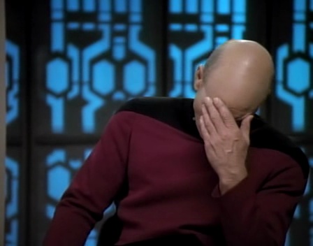 :facepalm5:
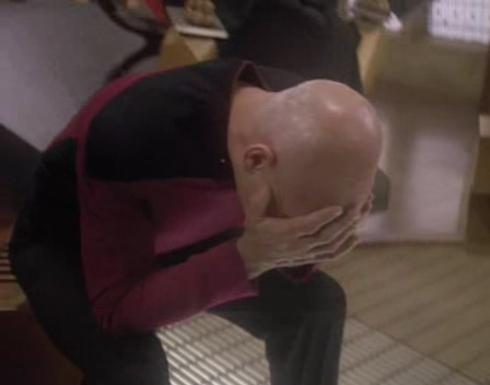
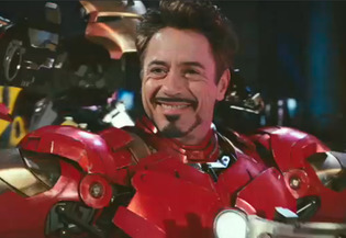
We have the Cloud Deal with it now.. and do we need so many facepalms? There's still so many others after that, that are used


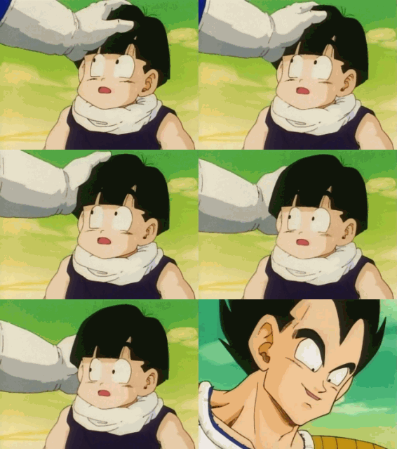


..I don't... I just don't know.
This is one purger's opinion. I'm also gonna fix my pinkmon and offer other rage comic emotes to make it fun.


Were these ever used other than the one time someone made them?


We have stationary and then moving forms of some of the same costume mon emotes...

I didn't know we have this but I'm gonna use it

:twiddlequeen::telly::snuffy::slimey::prairiedawn2::littlebird::twiddlebug: :sully::slimey2::rosita::kingston::bettylou::bigbird::elmo::elmo3: :franklin::honker: :kermit2::herry::ernie::elmo2:
 :biff::bert: :babybear::barkley::bettylou::bigbird:
Do we really need aaaaalllll of these when no one gives a crap? Oscar since he is used but otherwise...


A lot of the birthday emotes/gifs we end up googling for people anyway to try and be more personable but still left a couple after that

:deal:
 :facepalm5:
We have the Cloud Deal with it now.. and do we need so many facepalms? There's still so many others after that, that are used


..I don't... I just don't know.
This is one purger's opinion. I'm also gonna fix my pinkmon and offer other rage comic emotes to make it fun.

