
You are using an out of date browser. It may not display this or other websites correctly.
You should upgrade or use an alternative browser.
You should upgrade or use an alternative browser.
Final Fantasy XV (was Versus XIII)
- Thread starter Arianna
- Start date


Lulcielid
Eyes of the Lord
- AKA
- Lulcy
To anyone going at Japan Expo, unreleased clips of KINGSGLAIVE will be shown there.
https://www.facebook.com/SquareEnix...71439107220/10154188351437221/?type=3&theater
https://www.facebook.com/SquareEnix...71439107220/10154188351437221/?type=3&theater
Lulcielid
Eyes of the Lord
- AKA
- Lulcy
At the time of this writing, the first 10 minutes of KINGSGLAIVE are being shown. The streamers are mostly showing off camera, only the audio can be hearded though.To anyone going at Japan Expo, unreleased clips of KINGSGLAIVE will be shown there.
https://www.facebook.com/SquareEnix...71439107220/10154188351437221/?type=3&theater
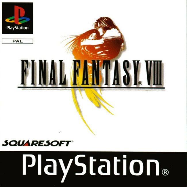
 ). FFXIII wasn't plain, FFXIV wasn't plain... at least according to the wikis, I bought neither game
  . I do like me some minimalist box art.
Lex
Administrator
As I said, it's reversible, so there's that at least.
IDK, it's a marketing thing. US designs are always extreme and messy/ busy, designed to be "eye-catching" to a US audience. Trying to read the spines of a game cover requires patience and a magnifying glass. In the UK all you need are eyes, because it's just beautiful simple text. They haven't changed that much at least (the simple spines and designs for EU), but more and more companies are just giving us the trickle-down US box art out of laziness and probably taking a sales hit here in the process.
IDK, it's a marketing thing. US designs are always extreme and messy/ busy, designed to be "eye-catching" to a US audience. Trying to read the spines of a game cover requires patience and a magnifying glass. In the UK all you need are eyes, because it's just beautiful simple text. They haven't changed that much at least (the simple spines and designs for EU), but more and more companies are just giving us the trickle-down US box art out of laziness and probably taking a sales hit here in the process.
ForceStealer
Double Growth
I understand that the US doesn't get the just-the-logo boxes, but I don't think any of them have been "extreme and busy." Usually it's just a picture of the main character. The only really bad ones, imo, are IX and XII. And I still maintain that the washed out art on the US FF7 box is perfect.
I definitely agree on that one that the logo is way too small.
I definitely agree on that one that the logo is way too small.
Last edited:
Tennyo
Higher Further Faster
Logo is too small. Box art is okay, though I was expecting something else.
This. There's a lot of empty space in the clouds for it to take up.
Lex
Administrator
I understand that the US doesn't get the just-the-logo boxes, but I don't think any of them have been "extreme and busy." Usually it's just a picture of the main character. The only really bad ones, imo, are IX and XII. And I still maintain that the washed out art on the US FF7 box is perfect.
I definitely agree on that one that the logo is way too small.
Of course you don't Force, because - being an american - you're accustomed to it in every facet of your marketing. You can't walk down a detergent isle at Wal-Mart without an all out assault on the eyes in the form of a colour explosion. Even books. Harry Potter cover art in the US is designed to be as flashy and horrendous as possible over there, it wasn't even allowed a simple font. Everything has to try to stand out because of the way it's marketed there, because if it looked "boring" it wouldn't sell. No matter what happens, if you're in North America you're going to think everything else looks boring in comparison. Your brain is wired that way.
To you, ours is bland and boring. To us, yours is garish and over the top. We prefer the classier style and I'm gonna be mad if we get landed with the horrible loud one meant for americans just because SE's marketing team have decided to be lazy.
Obsidian Fire
Ahk Morn!
- AKA
- The Engineer
I love European graphics. Then again, I live right next door to Hollywood and am more then a tad dyslexic. I don't think it's a coincidence that the advice I give the most to my classmates in graphic design is "simplify; it looks too busy here and I don't know what to focus on visually". I like my designs to be clean and minimalist not just because it looks good, but because it takes me way less time to design.
On the flip-side, minimalist design gives a lot less leeway to mess up on things like alignment and composition then busier design styles do. I you don't know how to align or balance parts of the design correctly, then everyone is going to notice. It also isn't the greatest when you have a lot of information to display all at once.
On the flip-side, minimalist design gives a lot less leeway to mess up on things like alignment and composition then busier design styles do. I you don't know how to align or balance parts of the design correctly, then everyone is going to notice. It also isn't the greatest when you have a lot of information to display all at once.
ForceStealer
Double Growth
I understand that the US doesn't get the just-the-logo boxes, but I don't think any of them have been "extreme and busy." Usually it's just a picture of the main character. The only really bad ones, imo, are IX and XII. And I still maintain that the washed out art on the US FF7 box is perfect.
I definitely agree on that one that the logo is way too small.
Of course you don't Force, because - being an american - you're accustomed to it in every facet of your marketing. You can't walk down a detergent isle at Wal-Mart without an all out assault on the eyes in the form of a colour explosion. Even books. Harry Potter cover art in the US is designed to be as flashy and horrendous as possible over there, it wasn't even allowed a simple font. Everything has to try to stand out because of the way it's marketed there, because if it looked "boring" it wouldn't sell. No matter what happens, if you're in North America you're going to think everything else looks boring in comparison. Your brain is wired that way.
To you, ours is bland and boring. To us, yours is garish and over the top. We prefer the classier style and I'm gonna be mad if we get landed with the horrible loud one meant for americans just because SE's marketing team have decided to be lazy.
I'm not arguing that US marketing is loud. Nor did I say the European boxes are boring. I'm arguing that our Final Fantasy boxes (save 9 and 12) have not been loud and busy, and have been much more subdued compared to most other games.

Yes, that is more than just the text, but it is by no means "busy." It's just a picture of Lightning on a featureless off-white background.
THAT'S busy. A busy confusing mess. (And the same box Europe got, incidentally).
I just think this:

happens to be a beautiful cover, that doesn't mean I think the European one is boring.
Lulcielid
Eyes of the Lord
- AKA
- Lulcy
I would like to know how exactly how the american box art is "extreme and lousy"?
I don´t remember if I(or any of you) posted the other box arts of the game, I´ll do it regarless, they could make for a good comparison.
Japanese Box Art:

American box art

Special edition box art (I think this one is for Europe only, also not to be confused with the deluxe edition)

FFXV Deluxe Editon Box Art

I don´t remember if I(or any of you) posted the other box arts of the game, I´ll do it regarless, they could make for a good comparison.
Japanese Box Art:
American box art
Special edition box art (I think this one is for Europe only, also not to be confused with the deluxe edition)
FFXV Deluxe Editon Box Art
Last edited:
ForceStealer
Double Growth
@Lucelid: While I also was disputing Lex's use of the terms "extreme" or "busy," what he's talking about is a desire that that box art would be similar to the old games' European box art which is just the game's logo on a white background. (
 )
)
Though, I will say I'm surprised by the Japanese boxart. To my knowledge they also usually got just the plain logo.
Though, I will say I'm surprised by the Japanese boxart. To my knowledge they also usually got just the plain logo.
Lulcielid
Eyes of the Lord
- AKA
- Lulcy
The japanese one has the plain logo as its box art, as a reversible.Though, I will say I'm surprised by the Japanese boxart. To my knowledge they also usually got just the plain logo.
ForceStealer
Double Growth
Ah yes, forgot.
Cthulhu
Administrator
- AKA
- Yop
I don't like it, purely because - from a naive point of view - it's a group of generic randoms doing er, what the fuck are they doing, and why should I care. What kind of game is that anyway, a DDR clone?
Off course, more 'Murcan album covers are the type that are dripping with testosterone and manliness and shit.
I know nothing of video game covers, how do I video gaem ¯\_(ツ)_/¯
Off course, more 'Murcan album covers are the type that are dripping with testosterone and manliness and shit.
I know nothing of video game covers, how do I video gaem ¯\_(ツ)_/¯
Flare
Pro Adventurer
- AKA
- Flare
For the record, since I'm American, I find the simple white backgrounds with the FF title and unique logo on it to be quite gorgeous.  In fact I often prefer it over the covers over here too and wish they were all reversible or something, one side being simplistic while the other is more dynamic or shows the main character.
However I did love
 over here too, with Tidus. Something very nice about that one.
I don't mind XII's or XIII's either, XIII is pretty simple too with just Lightning on a white background. I don't mind XII's American version but I like the one with the logo soooo much:

For XV's, I like the Japanese box art and the European(?) special edition one with the artwork cover. American one is pretty cool to me, but I like the more casual, landscape sweep of Japan's better.
In fact I often prefer it over the covers over here too and wish they were all reversible or something, one side being simplistic while the other is more dynamic or shows the main character. However I did love
I don't mind XII's or XIII's either, XIII is pretty simple too with just Lightning on a white background. I don't mind XII's American version but I like the one with the logo soooo much:
For XV's, I like the Japanese box art and the European(?) special edition one with the artwork cover. American one is pretty cool to me, but I like the more casual, landscape sweep of Japan's better.
Tashasaurous
Tash for Short
- AKA
- Sailor Moon, Mini Moon, Hotaru, Cardcaptor Sakura, Meilin, Xion, Kairi, Aqua, Tifa, Aerith, Yuffie, Elena, Misty, May, Dawn, Casey, Fiona, Ellie
The western cover art for the game here in Australia will probably be the same. The only difference is the ratings logos we get.
Our ratings are in different colours.
For family it's G which is in a green triangle.
For people under 15 it's PG which is in a rectangle yellow box.
For people who are 15 years and older, it's M in a blue box with a circle around it.
Games, movies and shows in rated MA(not for people under fifteen, unless accompined by parents or adult guardians) are in red boxs.
And for super gory, violent films restricted to adults is rated R in a drak gray box.
Then again, there's always extra warning text that goes along pretty much all of the ratings in Australia.
The cover art is cool, though. But I think I prefer the Japanese art cover better.