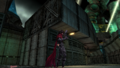
As Reno and Rude escape from the crater with Jenova’s head, you can see the snow and clouds more clearly due to the enhanced detail, and altered lighting.
The lifestream is has a slightly more blue glow, and is animated differently. The background now looks blurred, and out of focus, instead of the underwater-like look.
The blue lightning along the back of Meteor is now red, and the aura around it has been reduced so that is a lot easier to see the details. In addition to this, the color of the surface has been darkened, and provides a greater contrast between the firey magma core and the outer surface.
The continents on the Planet are more visible. The stars have been reduces in brightness and number, and the moon has better lighting.
The lighting on Sephiroth is vastly improved, and the way it falls on his face causes his eyes to be obscured, and his expression is more sinister.


No comments yet
Log in or Register
A lot of these new changes were so awesome. The animation is so much better!
I especially thought that the scene with Sephiroth in the first was particularly more badass.
It’s absolutely gorgeous.
Just when I thought, back in 2005, that they couldn’t surpass what they had created they come up with ACC 4 years down the road and blew my mind once again.
Finished the update. It’s now 6 pages with 32 images. Enjoy!
X
Awesome job guys for compiling this for us. ACC is just amazing 🙂
Yeah I also noticed lot of differences when I watched the movie (yesterday *_*). Colors are better and I like the realistic effect they put on characters like blood, dirt and water. Also I totally love the new flashback about Zack. He’s a really great character and in the previous movie, the images of Cloud’s memory were too blueish and less clear.
Wow, those blu-ray pictures are beautiful. Just when I thought the graphics in the original couldn’t get better….I was just proven wrong in a major way… =D
I made one too! Tifa has her gloves back on in this scene! ^_^
http://img.photobucket.com/albums/v369/A-20/gloves-acc.jpg
Oh snap, I never notice that…good eyes
I thought I noticed a lot of the changes, but this really points out the subtle differences in lighting and such. The change in lighting on Cloud’s face is particularly striking.
looks like they made an effort to de-ugly things a bit and give us something to look at other than grayish blobs
Did you all purposely leave out the changes in Aerith’s character?
I kind of thought the graphic difference for Aerith during the church scene was much more significant then say Tifa’s or Kadaj’s changes.
Guess it doesn’t matter, though.
the detail is astounding
I’ve REALLY been looking for a screenshot of this movie, it’s the one of Zack’s sword at the end of the movie, after the credits IN GOOD QUALITY. I’d really like to have a rather huge picture of it for some graphic work, can someone PLEASE get a screenie of it for me?
Send it to julietnoknife(at)live(dot)ca or leave me a note hwere to get it here, by email or leave me a message on my deviantart account (connected to my name on here as a link)